


Most advice on cutting cost per lead starts inside the ad account: new bids and new audiences. But every paid click ends on a landing page, and that page decides how many of those clicks turn into leads.
At the same click price, a page that converts at half the rate doubles what you pay for each enquiry. A better page makes the same budget go further, without touching a single bid.
This guide covers 11 landing page optimization fixes, grouped in the order we’d tackle them. You’ll get:
- The cost per lead formula and the 2 levers your landing page controls.
- 11 fixes for message match, forms, speed, mobile, trust and tracking.
- A form audit table to decide which fields stay.
- A 30-day plan that puts the fixes in a sensible order.
1. How Your Landing Page Sets Your Cost Per Lead
The formula behind every lead
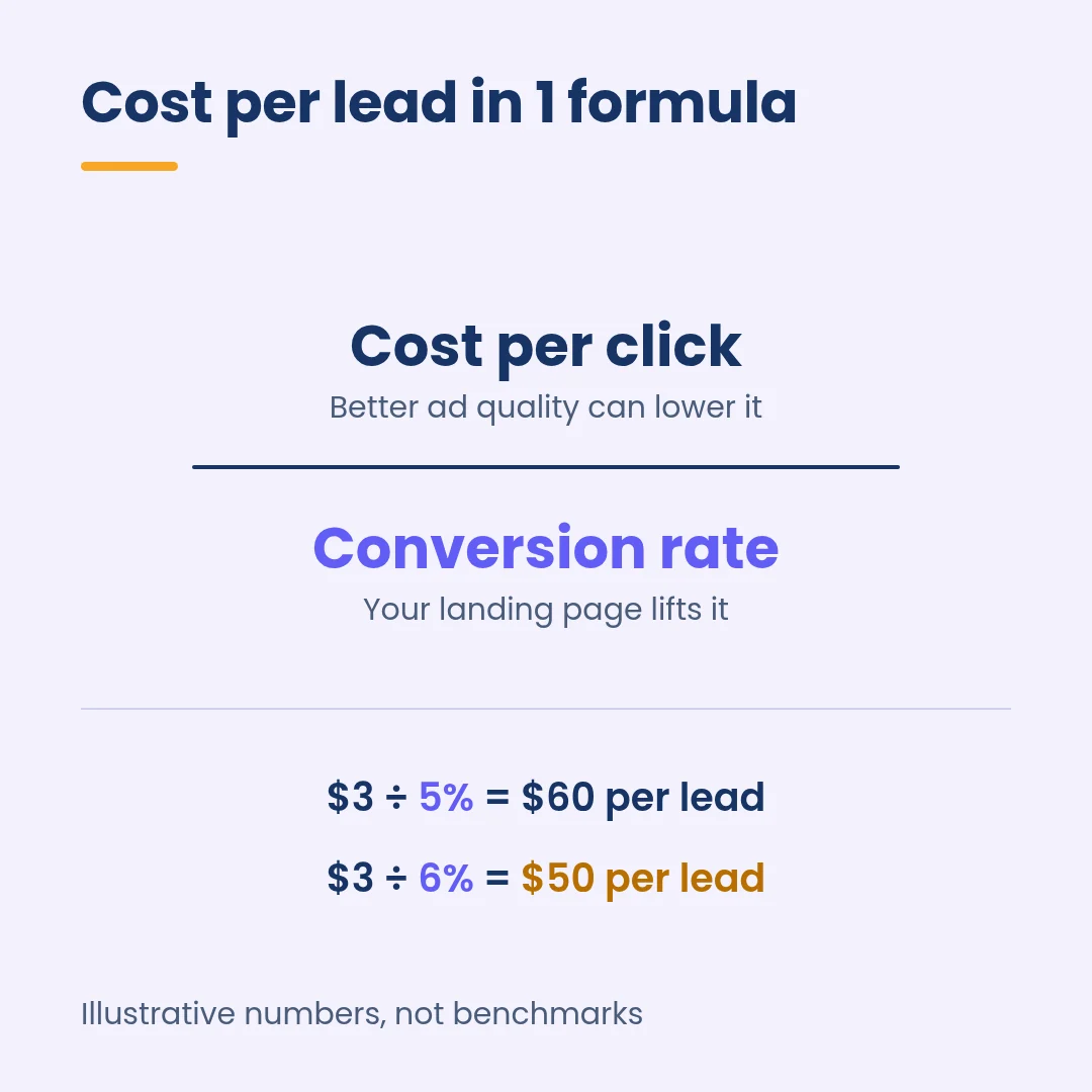
Cost per lead (CPL) is your ad spend divided by the leads it brings in. Break that down and you get a simpler version: CPL = cost per click ÷ conversion rate.
Take an illustrative campaign paying $3 a click with a 5% landing page conversion rate. Each lead costs $3 ÷ 0.05 = $60. Lift the conversion rate to 6% and the same click now produces leads at $50, about 17% less, with no change to the budget.
If you want the full walk-through of the maths, our guide to the cost per lead formula covers it step by step.
Where Google looks at your page
Conversion rate is the obvious lever. The second is quieter: Google uses your landing page when it prices your clicks.
According to Google’s Ad Rank documentation, ad quality includes the usefulness and relevance of your landing page and how easy it is to navigate. Google adds that higher quality ads can often lead to lower CPCs.
Landing page experience is also 1 of the 3 parts of Quality Score, next to expected clickthrough rate and ad relevance. Google rates each part as above average, average or below average against other advertisers on the same searches.
Why AI Max makes the page even more important
If you run AI Max for Search, your site now writes part of your ads. With text customization and final URL expansion switched on, Google may swap your final URL for a page it judges more relevant and generate headlines to match that page’s content.
So a vague, thin landing page now hurts twice: it converts fewer clicks, and it gives Google weaker material for your ad copy. Our AI Max for Search setup guide explains how to control which pages it can use.
| Lever | What the landing page changes | Where to check it |
|---|---|---|
| Conversion rate | Share of clicks that become leads | Google Ads conversions, GA4 key events |
| Cost per click | Ad quality, including landing page experience | Quality Score columns in the Keywords report |
| Ad copy (AI Max) | Text Google generates from your page | Asset report |
2. Fixes 1 to 3: Make the Page Match the Click
Fix 1: Give each ad group its own page
Google’s Quality Score guidance uses a simple example: if someone searches for flannel shirts and clicks your flannel shirt ad, the page should show flannel shirts, not your whole catalogue.
For a service business, the same rule applies to services. A “boiler repair” ad group should land on a boiler repair page, not the homepage with 9 services in the menu.
Open your search terms report, group the top searches by theme and check that each theme has a page built for it. Where 1 page is serving very different searches, split the ad group or build a second page.
Fix 2: Repeat the ad’s offer and call to action above the fold
Google’s landing page advice says the page should mirror the call to action in your ad. If the ad promises a free tour, the sign-up form should be easy to find.
It also recommends putting important information near the top so visitors don’t have to scroll to find it. In practice, that means 3 things on the first screen of a phone: the headline that echoes the ad, the offer in the same words and the button or form.
If the ad says “Free quote in 24 hours”, the page shouldn’t open with “Welcome to our company”. Small mismatches like that make people wonder if they clicked the wrong link.
Fix 3: Write at a plain reading level
Short words convert. In Unbounce’s 2024 Conversion Benchmark Report, pages written at a 5th to 7th grade reading level converted at 11.1%, more than 2x the 5.3% rate of pages written at a professional level.
The same report found a negative correlation between the number of words with 3 or more syllables and conversion rate. Financial services was the exception, where more complex language could help.
Read your headline and first paragraph out loud. If it sounds like a brochure, swap jargon for the words your customers use on the phone.
3. Fixes 4 to 6: Make the Form Easy to Finish
Fix 4: Cut every field you can collect later
The Nielsen Norman Group’s form usability guidelines recommend removing fields that can be found another way, asked for later or skipped altogether. NN/g applied this to 1 of its own forms and cut it from 6 fields to 2.
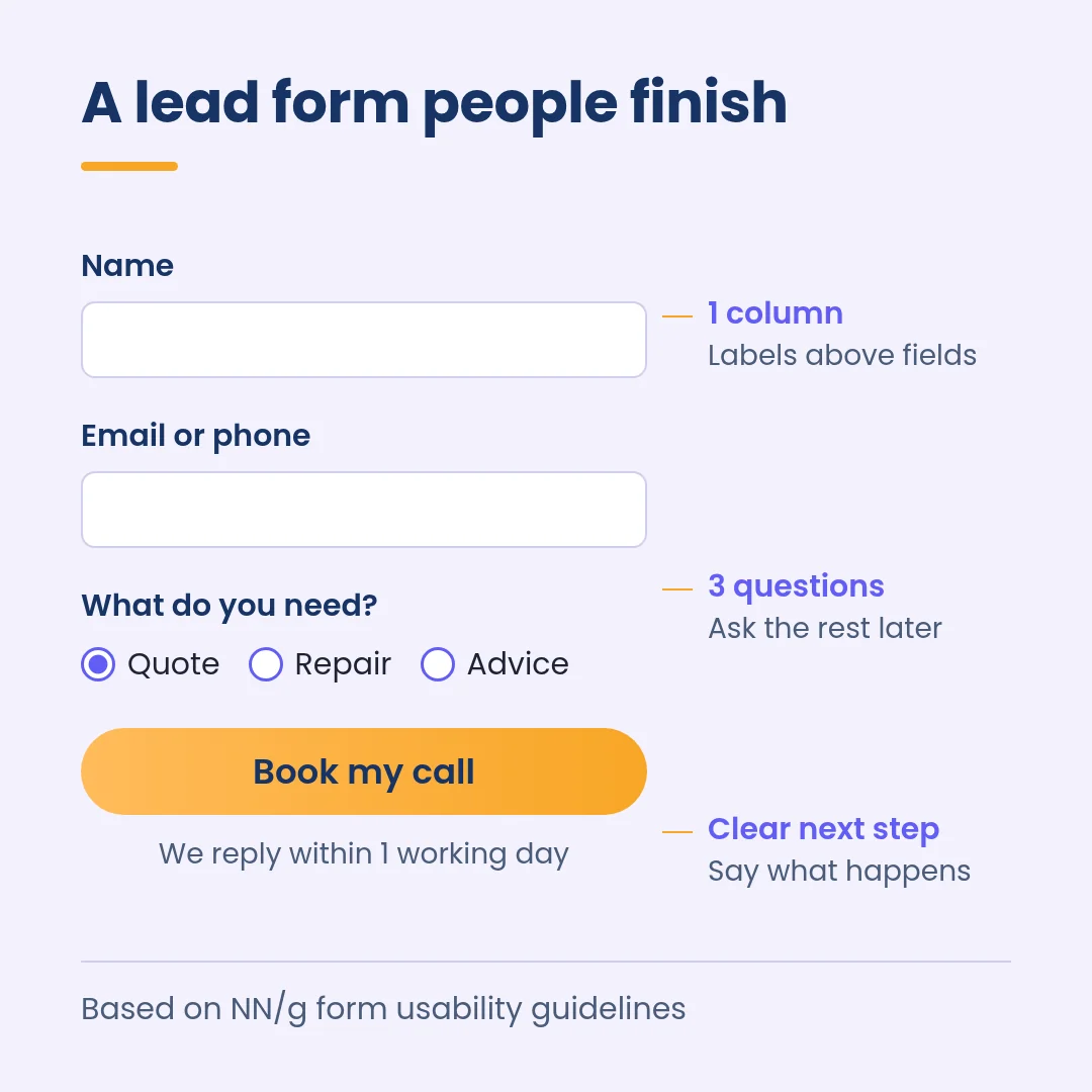
For most lead forms, name, email or phone and 1 qualifying question is enough to follow up. Budget, company size and job title can move to the first call or a second step.
Watch lead quality as you cut. A shorter form can bring in more enquiries and more junk, which is why it pays to send CRM outcomes back to the ad platforms, as covered in our guide to lead quality tracking.
| Field | Keep on the first form? | Alternative |
|---|---|---|
| Name | Yes | None needed |
| Email or phone | Yes, at least 1 | Let people choose their preferred contact method |
| Main need or service | Yes, as a short dropdown or radio buttons | None needed |
| Budget | Usually not | Ask on the call or in a 2nd step |
| Company size, job title | Usually not | Enrich from the email domain or ask later |
| “How did you hear about us?” | No | Use UTM tags and your analytics |
Fix 5: Use 1 column with labels above each field
NN/g recommends a single-column layout, with labels placed close to their fields (above them on mobile) and no placeholder text standing in for labels. Placeholder text vanishes as soon as someone starts typing, which makes it easy to forget what a field was asking for.
Use radio buttons instead of a dropdown when there are only 2 or 3 options, so people can answer with 1 tap. Mark optional fields clearly, and keep them to 1 or 2 at most.
Fix 6: Make errors and next steps obvious
When a form rejects an entry, say exactly what went wrong next to the field, and keep what the person already typed. NN/g also advises against Reset or Clear buttons, since the risk of wiping a form by accident outweighs any use.
Then say what happens after submitting. A line such as “We’ll call you within 1 working day” under the button sets expectations and makes the click feel safer.
The NN/g article cites a CHI study where forms that followed basic usability guidelines were submitted without errors on the first try 78% of the time, compared with 42% for forms that broke them.
4. Fixes 7 to 9: Speed Up the Page and Design for Thumbs
Fix 7: Hit the Core Web Vitals thresholds
Google’s Core Web Vitals give you 3 targets to aim for at the 75th percentile of visits: Largest Contentful Paint within 2.5 seconds, Interaction to Next Paint of 200 milliseconds or less and Cumulative Layout Shift of 0.1 or less.
On landing pages, the usual culprits are oversized hero images, heavy page builders, chat widgets and a stack of tracking scripts loading before the form.
PageSpeed Insights shows Chrome field data for your page where enough of it exists, so you see what visitors experience, not only a lab test.
Google’s own Quality Score advice is blunt here: the speed at which your page loads can be the difference between someone bouncing or buying.
Fix 8: Build for the phone first
In Unbounce’s sample, 83% of landing page visits happened on mobile devices, yet desktop still converted 8% better than mobile on average.
Make buttons big enough to hit with a thumb. The W3C’s target size guideline sets a minimum of 24 by 24 CSS pixels for tap targets, so treat that as a floor for your form fields and buttons, not a target.
For businesses that take enquiries by phone, add a tap-to-call button in the first screen and track calls as conversions, so they show up in your cost per lead.
Fix 9: Remove pop-ups and extra exits
Google’s help centre lists the number of links on a page as part of landing page experience, and its advice warns against cluttering pages with too many ads or pop-ups.
Strip the main menu, blog links and social icons from paid landing pages. Every exit you remove is a way out that a paid click can no longer take.
If you need a cookie banner, keep it compact and make sure it doesn’t cover the form or the main button on a small screen.
5. Fixes 10 and 11: Build Trust and Track Every Lead
Fix 10: Put proof next to the form
Visitors check you out before they hand over their details. BrightLocal’s 2026 Local Consumer Review Survey found that after reading positive reviews, 54% of consumers go on to check the business’s website.
Your landing page is often where that check happens. Place 2 or 3 short reviews, a star rating with its source or recognisable client logos close to the form, not in a carousel at the bottom of the page.
Only use proof you can back up, from customers who have agreed to be quoted.
Fix 11: Track the lead properly, then test 1 change at a time
None of these fixes can be judged if the conversion tag is wrong. Check that each form or call conversion fires once per lead, on a thank-you page or confirmed submit event, and that test submissions are filtered out.
Google suggests using conversion rate as a proxy for landing page experience. It won’t change your Quality Score status directly, but it’s the number you’ll use to judge every change.
Change 1 element at a time and run each version long enough to collect a meaningful number of leads before you call it. Our landing page optimization checker and conversion rate calculator help you size up each page first.
Conclusion: Your 30-Day Landing Page Plan
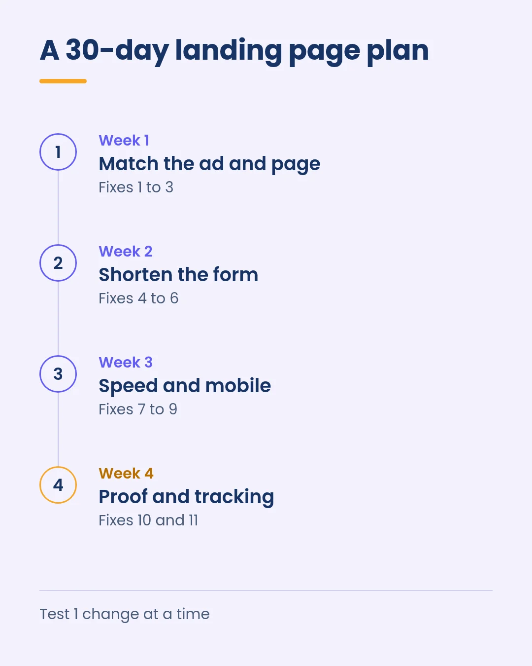
You don’t need a redesign to bring cost per lead down. Most of these fixes are copy, layout and tracking changes you can ship in a few weeks:
- Week 1: map each ad group to a matching page and repeat the ad’s offer above the fold (fixes 1 to 3).
- Week 2: cut and reorder form fields, fix error messages and add a next-step line (fixes 4 to 6).
- Week 3: work on Core Web Vitals, tap targets and pop-ups on mobile (fixes 7 to 9).
- Week 4: move proof next to the form, confirm conversion tracking and start your first test (fixes 10 and 11).
Then keep watching lead quality. A lower cost per lead only pays off if those leads turn into customers.
Our free CRO checklist for landing pages is a quick way to audit each page against these fixes. If you’d like a second opinion on your paid landing pages, you can book a call with the Growth-onomics team.
FAQs
What is a good conversion rate for a lead generation landing page?
Unbounce’s 2024 report put the median landing page conversion rate across all industries at 6.6%, with industry medians ranging from 3.8% to 12.3%.
Compare yourself with your own industry and traffic source, and weigh conversion rate against lead value, since a page with fewer but better leads can still win.
Can a better landing page lower my Google Ads cost per click?
It can help. Google includes landing page quality in Ad Rank and says higher quality ads can often lead to lower CPCs. Landing page experience is also 1 of the 3 Quality Score components.
The bigger and more direct effect is usually on conversion rate, which lowers cost per lead even when CPC stays flat.
Should I send paid traffic to my homepage or a dedicated landing page?
A dedicated page that matches each ad group usually does a better job. Homepages serve many audiences at once, while a paid landing page can repeat 1 offer and focus on 1 action.
Growth-onomics builds and A/B tests landing pages as part of our performance marketing and lead generation work.