

Vertical funnel charts help marketers visualize customer drop-offs at each stage of their sales pipeline, turning raw data into actionable insights. These charts identify bottlenecks, inefficiencies, and areas for improvement, enabling targeted strategies to boost conversions and revenue.
Key Takeaways:
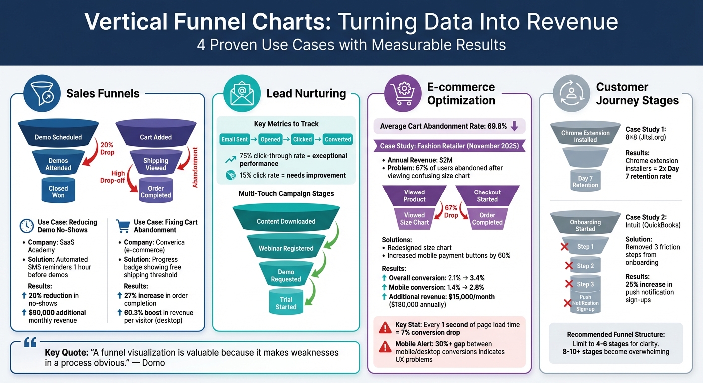
- Sales Funnels: Spot and fix issues like demo no-shows or cart abandonment. For example, SaaS Academy reduced demo no-shows by 20%, adding $90,000 in monthly revenue.
- Lead Nurturing: Analyze email campaigns or multi-touch journeys to improve conversion rates. Address weak spots like low click-through rates or ineffective webinars.
- E-commerce Optimization: Identify drop-offs in shopping journeys. Converica increased order completion by 27% by addressing hidden shipping costs.
- Customer Journeys: Map the full lifecycle from awareness to advocacy. Companies like Intuit boosted onboarding success by simplifying processes.
These charts simplify complex data, helping businesses focus on critical areas to improve user experience and drive growth.
Vertical Funnel Chart Impact: 4 Marketing Use Cases with ROI Results
1. Sales Funnels
Reducing Demo No-Shows with Targeted Interventions
SaaS Academy faced a major hurdle with high demo no-show rates. Their vertical funnel chart revealed a significant drop-off between the "Demo Scheduled" and "Demo Attended" stages – a clear bottleneck that was impacting revenue.
To tackle this, they introduced automated SMS reminders sent one hour before scheduled demos. The result? A 20% reduction in no-shows and an impressive $90,000 in additional monthly revenue. The funnel chart didn’t just highlight the problem – it provided the clarity needed to act quickly and measure the results. By identifying the issue and addressing it head-on, they optimized their sales funnel and improved their bottom line.
This type of funnel analysis isn’t limited to SaaS. It’s equally valuable in e-commerce.
Fixing Cart Abandonment with Transparent Shipping
Converica, an online retailer, used their funnel chart to analyze the customer journey, from product views to completed purchases. They spotted a sharp drop-off between "Add to Cart" and "Checkout Complete." After investigating, they discovered the main culprit: hidden shipping costs driving customers away.
To solve this, they added a progress badge on product pages, showing how close customers were to earning free shipping. This simple change led to a 27% increase in order completion rates and a 60.3% boost in revenue per visitor on desktop. The funnel chart turned a vague issue into a precise problem, allowing them to implement a solution that directly improved conversions and revenue.
2. Lead Nurturing
Breaking Down Email Sequences with Stage-by-Stage Insights
Vertical funnel charts are a powerful way to identify where your email campaigns might be losing steam. They map the journey from "Email Sent" to "Opened", "Clicked", and finally "Converted", spotlighting any weak spots.
Let’s say you send out 1,000 emails. If only 200 are opened and just 30 lead to clicks, that 15% click rate is a clear sign of trouble. On the other hand, a 75% click-through rate? That’s exceptional performance.
"Funnel charts can bring attention to stages within a process where a disproportionate number of participants are dropping off."
By zeroing in on these stage-to-stage conversion rates, you can focus your efforts where they’ll have the most impact. Beyond just email tweaks, vertical funnel charts can also sharpen your strategy for qualifying leads in more complex, multi-touch campaigns.
Tracking and Qualifying Leads in Multi-Touch Campaigns
Multi-stage nurturing is all about guiding prospects from initial awareness to active consideration. Vertical funnel charts make this process easier to follow, tracking key actions like "Content Downloaded", "Webinar Registered", "Demo Requested", and "Trial Started." Each stage reflects a growing level of interest and intent.
This approach helps you separate casual browsers from serious buyers. For example, if you notice a big drop between "Webinar Registered" and "Demo Requested", it might mean your webinar isn’t hitting the mark. That insight can lead to actionable changes – whether it’s improving your presentation, adjusting follow-up timing, or rethinking your offer to make it more compelling.
3. E-commerce Optimization
Diagnosing Product Page and Checkout Bottlenecks
Vertical funnel charts are a powerful tool for identifying where your e-commerce store might be losing revenue. By mapping the typical shopping journey – Website Visitor > Product View > Add to Cart > Checkout > Purchase – these charts can highlight exactly where customers drop off. With an average cart abandonment rate sitting at 69.8%, it’s clear that these visualizations can pinpoint the stages where friction occurs.
Take this example: In November 2025, a mid-sized fashion retailer with $2 million in annual revenue noticed that 67% of users who clicked on the size chart left the site immediately due to confusion. By redesigning the size chart and increasing the size of mobile payment buttons by 60%, the retailer saw their overall conversion rate rise from 2.1% to 3.4%. On mobile, conversions jumped from 1.4% to 2.8%. These changes brought in an additional $15,000 per month – adding up to $180,000 annually.
"The difference between struggling stores and thriving ones isn’t traffic, products, or even price. It’s visibility."
- FunnelAnalytics
Tracking Device-Specific Performance Gaps
After tackling product page issues, it’s worth digging deeper into device-specific performance. By creating separate vertical funnels for mobile and desktop, you can uncover hidden gaps. If your mobile-to-desktop conversion rate difference is more than 30%, you might be dealing with mobile UX problems like slow page speeds or small, hard-to-tap buttons. Keep in mind that for every extra second a page takes to load, conversions drop by 7% – a reminder of how crucial speed is.
These funnel charts don’t just show raw numbers; they also provide conversion percentages, making it easier to prioritize fixes. Whether it’s simplifying checkout fields, showing shipping costs upfront (a factor in 48% of cart abandonments), or enabling guest checkout to avoid forcing users to register, these insights guide you toward the most impactful changes.
sbb-itb-2ec70df
4. Customer Journey Stages
Mapping the Full Lifecycle from Awareness to Advocacy
A vertical funnel chart is a powerful way to track how customers progress from their first interaction to becoming loyal advocates. These customer journey funnels provide a comprehensive view of engagement across multiple touchpoints. Industries like B2B SaaS, media and publishing, and fintech rely on these insights to track milestones before and after a transaction.
For example, 8×8 (Jitsi.org) discovered that users who installed their Chrome extension doubled their Day 7 retention rate. Similarly, Intuit (QuickBooks) improved their onboarding process by removing three unnecessary steps that were creating friction. This adjustment resulted in a 25% boost in push notification sign-ups. By expanding the scope of funnel analysis, companies gain deeper insights into user engagement beyond the initial stages.
To make the most of these analyses, annotate each stage with three key metrics: absolute values, percentages relative to the first stage, and stage-to-stage conversion rates. This method allows you to pinpoint exactly where users drop off. For instance, a typical B2B SaaS journey might include stages like: Website Visit > Free Trial Sign-up > Account Setup > Paid Subscription. In fintech, the journey could look more like: App Download > Sign-up > Money Transfer > Executed Trade.
Andrea Wang highlights the importance of such metrics in refining customer journeys:
"The goal of a funnel analysis is to identify friction points throughout the customer journey where users are struggling to get to the next stage."
- Andrea Wang, Former Principal Product Manager, Amplitude
How to Build a Sales Funnel in Tableau
Conclusion
Vertical funnel charts simplify complex customer journeys, turning them into clear insights that highlight where users drop off and point the way toward meaningful improvements.
To make the most of these charts, it’s essential to use proportional sizing and focus on key metrics, ensuring the visuals remain clear and easy to read. Limiting your funnels to 4–6 stages keeps them manageable, as charts with more than 8–10 stages often become overwhelming and harder to interpret. This focused approach allows you to turn raw data into actionable strategies.
"A funnel visualization is valuable because it makes weaknesses in a process obvious." – Domo
FAQs
How do vertical funnel charts help marketers reduce customer drop-offs?
Vertical funnel charts are a handy way for marketers to track how customers move through different stages of a process and pinpoint where they drop off. These charts visually represent the flow, showing a narrowing shape as users exit at various stages – like during lead generation, checkout, or even after making a purchase.
By highlighting problem areas, such as a high checkout abandonment rate, businesses can take specific steps to address the issues. For example, streamlining the checkout process or improving the overall user experience can make a big difference in keeping customers engaged. Targeting these drop-off points helps businesses improve the customer journey, retain more users, and ultimately increase revenue.
How can e-commerce marketers use funnel charts to improve conversion rates?
Funnel charts are an excellent way to visualize and understand where potential customers drop off during their journey. They break down the process into stages – like awareness, consideration, and purchase – making it easier to see how people move through each step. This clarity allows marketers to identify exactly where customers are leaving and figure out how to keep them engaged.
To boost conversion rates, focus on making the checkout process easier, refining product pages, and tackling common issues like cart abandonment. Keep an eye on important metrics, such as add-to-cart rates and completed checkouts, to guide your efforts. By addressing the trouble spots highlighted in the funnel chart, businesses can streamline the customer experience and encourage more completed purchases.
How can vertical funnel charts improve lead nurturing campaigns?
Vertical funnel charts are a powerful tool for marketers to monitor how potential customers move through each stage of the sales funnel. They make it easy to pinpoint exactly where prospects are dropping off, highlighting problem areas that need attention. With this insight, marketers can adjust their strategies to improve each phase and ultimately increase conversion rates.
These charts also offer a straightforward visual breakdown of data, helping teams quickly evaluate performance and make smarter decisions to strengthen lead nurturing efforts.