
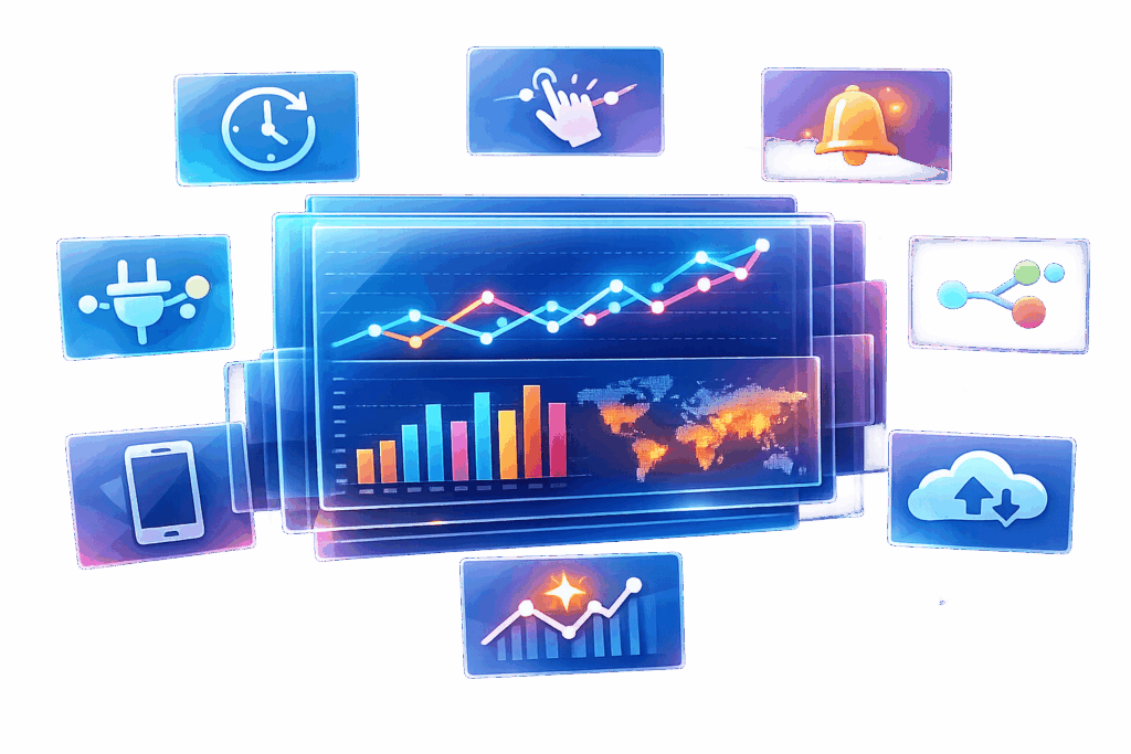
Real-time analytics dashboards are game-changers for businesses needing to make fast, informed decisions. Unlike traditional dashboards, they provide live data updates, enabling teams to act immediately. Here’s a quick overview of the key features that make them essential:
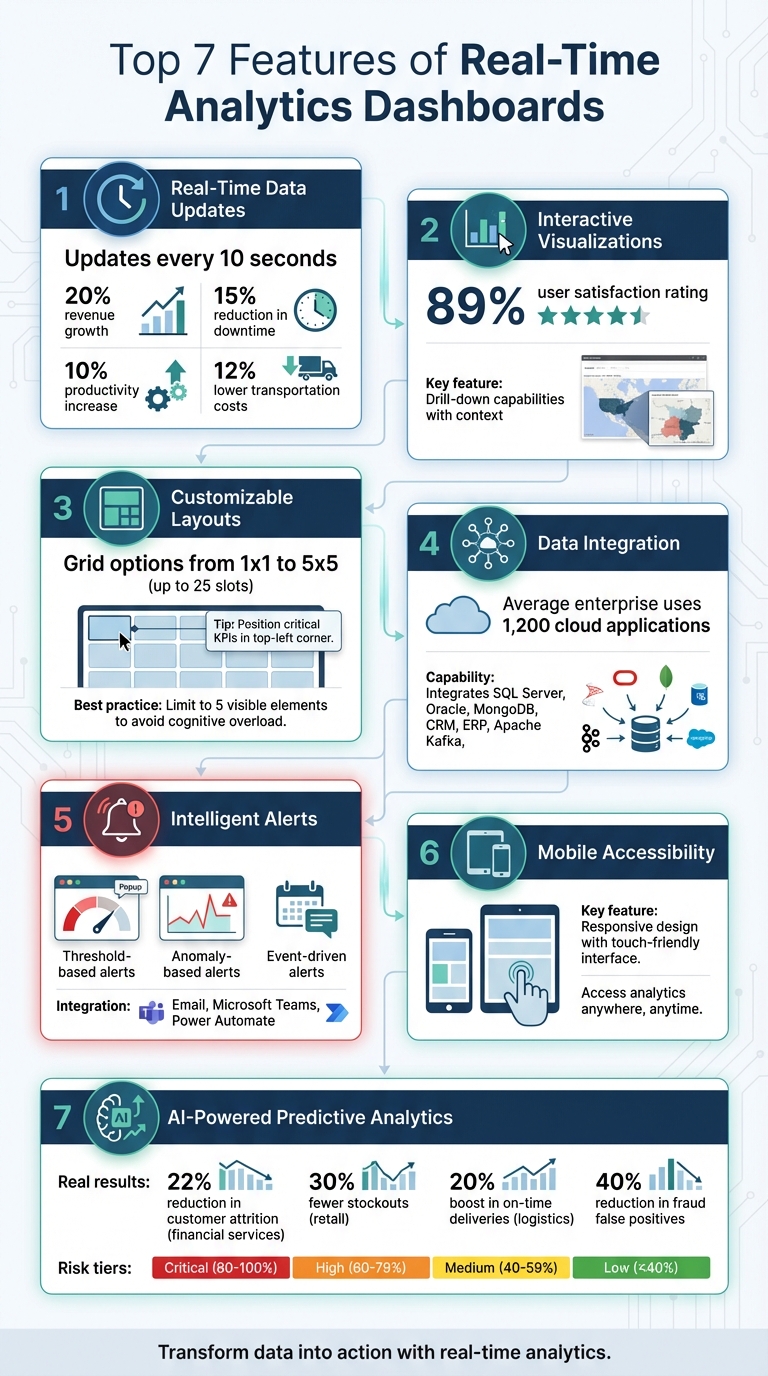
- Real-Time Data Updates: Refreshes every 10 seconds, providing up-to-the-moment insights.
- Interactive Visualizations: Lets you drill down into data for deeper understanding.
- Customizable Layouts: Tailor dashboards to specific roles and priorities.
- Data Integration: Combines data from multiple sources into one view.
- Intelligent Alerts: Sends notifications for critical changes or anomalies.
- Mobile Accessibility: Access dashboards anytime, anywhere.
- AI-Powered Predictive Analytics: Forecasts future trends and suggests actions.
These features help businesses monitor performance, respond to issues, and seize opportunities and generate quality leads in real time. Whether you’re managing performance marketing campaigns, IT systems, or supply chains, these tools ensure you stay ahead with accurate data and actionable insights.
7 Essential Features of Real-Time Analytics Dashboards
Build a Real-Time Analytics Dashboard in Minutes!
sbb-itb-2ec70df
1. Real-Time Data Updates
The standout feature of any real-time analytics dashboard is its ability to update data instantly – every 10 seconds [1]. This means teams no longer have to wait for yesterday’s reports to arrive at 7:00 AM. Instead, they can monitor metrics as they evolve, moment by moment.
This capability fundamentally changes decision-making. Instead of relying on quarterly boardroom strategies, teams can make on-the-spot operational decisions. This agility is a core component of a modern SEO content strategy, allowing brands to pivot based on live performance data. Take a marketing campaign that unexpectedly goes viral – managers can instantly reallocate ad budgets to capitalize on the momentum. Or consider a sudden spike in server traffic – IT teams can scale resources immediately to prevent slowdowns before users are affected.
Real-time data also eliminates delays in feedback loops. With traditional analytics, there’s often a lag between taking action and seeing the results. But with live updates, businesses can act fast. An e-commerce site, for instance, can test a new checkout process and watch conversion rates shift within minutes. Similarly, a logistics company can reroute drivers based on live traffic data and immediately see how it impacts delivery times. These quick insights often lead to measurable improvements.
"Real-time dashboards give teams the clarity to respond rather than wait for periodic reports." – Exology
The benefits of real-time monitoring are hard to ignore. It’s been shown to deliver up to 20% revenue growth, reduce downtime by 15%, increase productivity by 10%, and lower transportation costs by 12%.
To get the most out of real-time updates, combine live data with historical trends. Tools like trailing averages or comparison markers can help distinguish routine fluctuations from real issues. Automated alerts – sent via email or platforms like Microsoft Teams – can notify teams when metrics hit critical thresholds, ensuring they stay responsive even when they’re not actively monitoring the dashboard. This approach, blending live insights with historical context, ensures your real-time dashboard delivers maximum impact.
2. Interactive Visualizations
Interactive visualizations turn raw data into something you can actually use. They don’t just show numbers – they help you dig deeper to understand why those numbers are what they are. Instead of staring at static charts, you can interact with the data, filter it, and drill down to uncover the reasons behind spikes or dips. This makes spotting patterns quicker and easier.
Interactive dashboards shine because they offer drill-down features. You start with a high-level overview of key metrics – like conversion rates or sales numbers. If something stands out, such as a sudden drop in performance, you can click through to investigate without cluttering the main view. Filters let you focus on specific variables, like comparing regions or time periods, so you can separate real trends from random noise.
"A real-time number without context is meaningless." – Tinybird
These tools don’t just update data in real time – they add context, which is critical for making better decisions. For example, modern dashboards combine live data with historical benchmarks, helping you see how today’s numbers stack up against past performance. Plus, they’re built to handle massive amounts of data, supporting thousands of users and delivering query results in milliseconds.
And here’s the best part: you don’t need to be a data expert to use them. An impressive 89% of surveyed users rated Qlik Sense dashboards as excellent or good. Features like customizable views, hover-over details, collapsible sections, and smart color coding (reserving bright alerts for actual anomalies) keep the interface simple but powerful. This balance ensures you can dive into the data, spot trends, and act quickly – all without feeling overwhelmed.
3. Customizable Layouts
Customizable layouts take dashboards to the next level by tailoring them to fit specific roles and priorities. Whether it’s a CFO keeping an eye on revenue or a DevOps engineer tracking uptime, each role benefits from a dashboard that reflects their unique focus. These layouts let you arrange widgets, select key metrics, and design views that align with your everyday tasks. This kind of flexibility makes dashboards more practical and relevant to individual needs.
Modern dashboards often come with grid options ranging from a simple 1×1 slot to a 5×5 grid with up to 25 slots, giving you full control over where your essential metrics are displayed. You can drag and drop widgets, switch between chart types (like turning a bar chart into a heatmap), and even tweak the underlying queries to filter data for your department’s specific requirements. With hundreds of customizable components available, these dashboards work for a variety of industries – whether you’re managing a SaaS platform, running an eCommerce store, or overseeing a FinTech app.
Keeping your dashboard uncluttered is crucial. Experts suggest limiting visible elements to around five to avoid cognitive overload, especially when decisions need to be made quickly. Position your most critical KPIs in the top-left corner, as this is where attention naturally gravitates first. Secondary details can be tucked behind drill-downs or filters, keeping the primary view clean and easy to interpret.
"Personalization allows users to tailor dashboards to their roles, improving relevance and efficiency." – Karan Rawal, Performance and Scalability Specialist
Colors can also play a big role. Assigning red to critical alerts and green to healthy metrics provides instant clarity. And if your priorities change, you can easily toggle between viewing and editing modes to rearrange everything without starting from scratch. This ensures your dashboard stays aligned with your immediate goals and priorities.
4. Data Integration Capabilities
Data integration takes the concept of customizable layouts a step further by bringing together information from various sources into one cohesive view. Dashboards become far more effective when they pull data from multiple business systems. Modern solutions can tap into a wide range of data sources, such as internal databases like SQL Server, Oracle, and MongoDB, cloud-based applications like CRM and ERP systems, and even streaming platforms like Apache Kafka. By centralizing this information, you can eliminate the hassle of compiling reports from different tools, paving the way for real-time analysis that combines historical insights with current transactions.
Here’s a staggering fact: the average enterprise uses nearly 1,200 cloud applications to function, often creating massive data silos. A well-integrated dashboard can break down these silos, combining fragmented data into a unified view. For instance, linking Google Ads data with CRM revenue numbers can clearly show which marketing campaigns are driving sales. This kind of integration doesn’t just improve the accuracy of insights – it also strengthens the connection between day-to-day operations and long-term strategy.
External data sources, like financial feeds, social media activity, e-commerce transactions, or macroeconomic metrics, can also be integrated to offer a more complete picture. This capability allows businesses to react to market shifts in real time. For example, detecting fraudulent activity as it happens is far more valuable than finding out after the damage is done.
"Real-time data integration involves capturing and processing data from multiple sources as soon as it’s available, then immediately integrating it into a target system." – Alexandra Jonker and Tom Krantz, IBM
From a technical perspective, tools like WebSockets provide continuous, real-time updates, making them perfect for tracking dynamic metrics like stock prices or live inventory levels. Change Data Capture (CDC) is another powerful technique, as it minimizes network strain by transmitting only data changes rather than entire datasets. These innovations ensure that your dashboard can handle millions of data points daily without losing responsiveness.
5. Intelligent Alerts and Notifications
A dashboard isn’t just about displaying data – it becomes indispensable when it provides timely alerts. These alerts notify users the moment metrics cross set thresholds or deviate from expected patterns. This ensures your team gets actionable notifications only when necessary, removing the burden of constant monitoring. In essence, this system is what enables dashboards to drive real-time, proactive responses.
Alerts generally fall into three main types:
- Threshold-based alerts: These activate when a metric hits a specific limit, like inventory dropping too low or spending nearing a budget cap.
- Anomaly-based alerts: These use pattern recognition to detect unusual deviations from historical trends. For example, a sudden drop in website traffic or a spike in server latency could signal a potential DDoS attack.
- Event-driven alerts: These respond to specific actions or changes, such as when an order is shipped or a payment fails.
"Real-time analytics tools can trigger automated alerts when specific limits are met or anomalies are detected, which allows teams to react as soon as the problem appears." – Tableau
The real power of alerts becomes evident when they are integrated with automation tools. For instance, when a critical threshold is breached, the system can automatically trigger a Power Automate flow, send notifications through Microsoft Teams or email, or even initiate corrective actions without requiring human input. This integration turns alerts into a dynamic intelligence layer, enabling swift, data-driven decisions in time-sensitive fields like logistics, retail, and IT.
To avoid overwhelming users with unnecessary notifications, focus on configuring alerts for metrics that demand immediate action. Use high-contrast colors sparingly, reserving them for true emergencies. If an issue can wait until the next report, it doesn’t need an instant alert. When done right, alerts create a fast feedback loop between events and decisions, giving your business a clear edge over competitors.
6. Mobile Accessibility
Being able to access your analytics dashboard from a smartphone or tablet can make a huge difference in how quickly you respond to changes. Mobile-optimized dashboards keep you connected to your operations no matter where you are, giving you instant access to live performance metrics. This means you don’t have to wait until you’re back at your desk to make important decisions.
Mobile access is a game-changer when time is of the essence. If there’s a sudden drop in conversion rates or an unexpected spike in server errors, you can step in right away, no matter your location. This immediate access allows you to adjust workflows or address issues on the spot.
But it’s not just about access – it’s also about usability. A responsive design ensures that charts stack neatly, visuals adjust to smaller screens, and interactive elements are touch-friendly. Features like large tap targets, intuitive swipe gestures, and pinch-to-zoom make navigating on a mobile device smooth and frustration-free.
To make this work seamlessly, performance optimization is key. Using lightweight protocols and client-side rendering ensures data loads quickly and reliably, even on cellular networks. Pair this with mobile push notifications, and you’ve got a powerful system: get an alert, check the dashboard instantly, and act with full context.
This level of mobility is especially helpful for field teams and executives who need to stay in the loop at all times. When your dashboard fits in your pocket, you’re free to stay proactive without being tied to a desk.
7. AI-Powered Predictive Analytics
Dashboards are no longer just about showing past data – they’re now predicting future outcomes. Thanks to machine learning, these tools analyze historical data like trends, correlations, and anomalies to forecast what’s coming and even suggest actions to prevent potential problems.
Modern dashboards use SHAP values to explain the reasoning behind each prediction. For instance, if a customer gets an 85% churn risk score, the dashboard can highlight contributing factors such as the number of days since their last order, their return rate, or a drop in engagement. This level of detail not only builds confidence in the predictions but also helps you understand the reasoning behind them. Some platforms go a step further by integrating with large language models (LLMs), which can turn raw data into actionable advice. For example, the system might suggest offering a shipping credit to customers at high risk of leaving.
The impact of predictive analytics is clear. In 2024, a financial services company reduced customer attrition by 22% by connecting support interactions with churn risk. A retail company slashed stockouts by 30% using demand forecasting, while a logistics firm boosted on-time deliveries by 20%. Even in fraud detection, AI has shown its strength, cutting false positives by as much as 40%.
AI also helps prioritize decisions by categorizing risk levels into clear tiers: Critical (80%–100%), High (60%–79%), Medium (40%–59%), and Low (below 40%). This way, you can focus your efforts on the most urgent cases – for example, addressing customers with an 80%+ churn probability first – while keeping medium-risk customers on your radar with standard follow-ups.
To make the most of these tools, it’s crucial to align metric definitions across your organization before deploying AI. Keep an eye on how well predictions match real outcomes and set up automated retraining pipelines – starting with quarterly updates is a good idea – to adapt to changing patterns. To manage costs, focus deep AI insights on high-priority cases, such as customers with churn probabilities above 70%.
Conclusion
These dashboards bring together speed, interactivity, and smart analytics to enhance business performance. Real-time analytics dashboards have shifted from being passive reporting tools to active decision-making engines. The seven key features – real-time updates, interactive visualizations, customizable layouts, data integration, intelligent alerts, mobile accessibility, and AI-powered predictive analytics – work together to close the gap between identifying an issue and taking action. This speed advantage allows businesses to respond faster, refine solutions, and move from putting out fires to addressing challenges proactively.
Consider these examples: an online retailer increased revenue by 20%, a manufacturer reduced downtime by 15% while boosting productivity by 10%, and a logistics company cut costs by 12% and improved on-time deliveries by 5% – all achieved through the effective use of real-time dashboards.
"A dashboard does not become more useful by becoming more exhaustive. It becomes powerful by being focused."
– Cameron Archer, Tech Writer, Tinybird
Success lies in prioritizing decisions over overwhelming dashboards with unnecessary metrics. Highlight data that demands immediate action, and save less urgent details for secondary views. Synchronize refresh rates with your team’s response times – constant updates can create distractions rather than clarity. Most importantly, ensure data quality takes precedence over speed. As Cameron Archer points out, "People distrust dashboards because of low-quality data. AI won’t fix that".
When implemented effectively, these dashboards provide a single, reliable source of truth that empowers every team member. Whether it’s executives making high-level decisions or field teams managing daily operations, everyone can access real-time, accurate data from anywhere. This unified approach transforms analytics into a tool for immediate action, turning insights into a competitive edge.
FAQs
How real-time does a real-time dashboard need to be?
Real-time dashboards are designed to process and present data as it happens, offering immediate insights that support quick decision-making. This capability helps businesses stay flexible and react promptly to shifting circumstances.
What data sources should I integrate first?
To build effective real-time dashboards and make quicker decisions, prioritize data sources with live monitoring and streaming capabilities. Look for platforms like transactional databases or real-time data systems that deliver critical metrics – such as sales figures, customer interactions, or system performance – in real time. Combining data from multiple sources, like CRM tools and e-commerce platforms, can provide deeper insights. Make sure the sources you choose are dependable, capable of handling high data volumes, and allow smooth streaming to ensure consistent and actionable insights.
How do I prevent alert fatigue with notifications?
To keep real-time analytics dashboards from becoming overwhelming, it’s important to manage the frequency and relevance of alerts effectively. Start by customizing notifications – set specific thresholds, prioritize key updates, and filter out non-essential data. This way, users only see updates that matter most to them, reducing unnecessary distractions and improving productivity. Make the most of dashboard customization tools to fine-tune alert settings, striking a balance between staying informed and avoiding alert overload.