
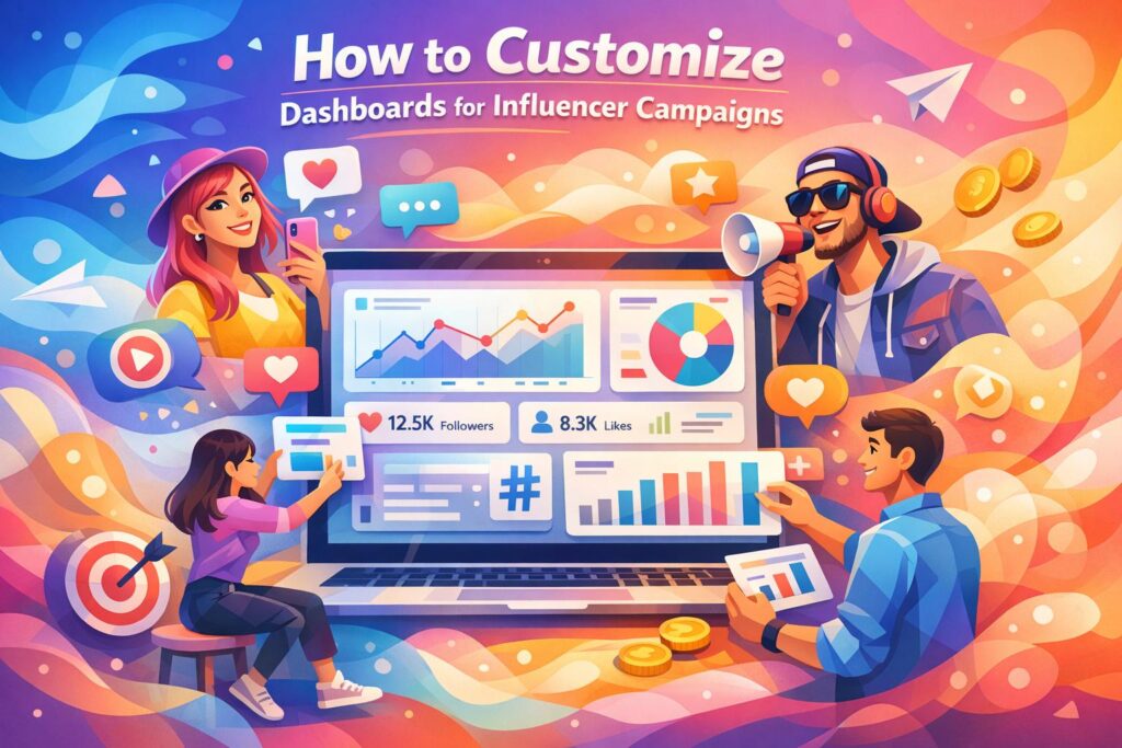
Running influencer campaigns without tracking is like driving blindfolded. You need a clear view of performance to make smart decisions. A customized dashboard consolidates all your campaign data – engagement, reach, conversions, and ROI – into one place, saving time and improving accuracy.
Here’s why it matters:
- 89% of marketers say influencer campaigns match or outperform other channels in ROI.
- Centralized data boosts ROI by 23%, while fragmented data creates inefficiencies.
- Tailored dashboards prioritize metrics that align with your goals, like brand awareness, sales, or web traffic.
To build an effective dashboard:
- Set clear goals and focus on 3–5 key metrics that matter most (e.g., reach, conversions, ROI).
- Integrate data sources like Google Analytics, social media APIs, and UTM links for accurate tracking.
- Design a clean layout with high-level KPIs at the top and detailed visualizations below.
- Use alerts to catch issues early, like budget overspends or engagement drops.
- Test and refine regularly to ensure accuracy and usability.
With influencer marketing projected to hit $21.1 billion by 2025, accurate tracking isn’t optional – it’s essential for smarter decisions and better results.
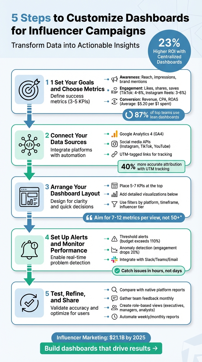
5-Step Process to Build Custom Influencer Campaign Dashboards
Influencer Marketing Campaign Metrics Dashboard
Step 1: Set Your Goals and Choose Metrics to Track
Before diving into metrics, take a step back and define what success looks like for your campaign. Without a clear objective, it’s easy to get overwhelmed by data that doesn’t tell you anything useful. In fact, 73% of marketers admit they struggle to measure influencer campaign performance accurately, often because they focus on the wrong data points.
Start by identifying your primary goal. Do you want to introduce your brand to a new audience? Drive traffic to your website? Boost sales? Each goal requires tracking different metrics. For example, if your focus is brand awareness for a new product launch, you’ll want to monitor reach, impressions, and brand mentions. But if you’re running an e-commerce campaign aimed at increasing revenue, metrics like conversion rate, revenue, and return on ad spend (ROAS) will be your priority.
To stay on track, limit yourself to 3–5 key performance indicators (KPIs) per campaign. This approach works – 87% of top-performing marketing teams use lean, actionable data dashboards to guide their decisions. Keeping your focus sharp ensures every metric you track aligns directly with your campaign’s purpose.
Key Performance Metrics for Influencer Campaigns
When deciding what to track, think about your customer’s journey and organize your metrics into three stages: Awareness (top-of-funnel), Engagement (middle-of-funnel), and Conversion (bottom-of-funnel).
- Awareness metrics measure how many people are exposed to your content. Reach represents the number of unique viewers, while impressions count total views. If you’re working with nano-influencers (under 10,000 followers), expect engagement rates of 5–15%, which is far higher than the 0.5–2% typical of macro-influencers. Nano-influencers can also deliver 10–30x ROI, compared to the 2–5x seen with larger influencers.
- Engagement metrics reflect how your audience interacts with your content. On TikTok, engagement rates typically range from 4–8%, while Instagram Reels average 3–6%. Beyond likes, track shares and saves – these often indicate deeper interest. For video content, completion rates are key, especially on platforms where users scroll quickly.
- Conversion metrics tie directly to revenue. Use tools like UTM parameters to track referral traffic, conversion rates, revenue, and cost per acquisition (CPA). On average, influencer campaigns generate $5.20 for every $1 spent. E-commerce campaigns often see a 12:1 ROAS, while B2B campaigns average 8:1.
Match Metrics to Your Campaign Goals
Your metrics should reflect what you’re trying to achieve. For example, if you’re a small business focused on building brand awareness, track cost-per-engagement (CPE) to measure how efficiently you’re gaining visibility. On the other hand, if your goal is direct sales, focus on cost-per-acquisition (CPA) and total revenue.
To measure performance accurately, set up tracking tools for each influencer. Use promo codes (e.g., "CREATORNAME2026") and UTM parameters. This allows you to see exactly which creators are driving results and which ones aren’t meeting expectations. Establish baseline metrics before the campaign starts so you can measure the actual impact of your influencers. Without a baseline, you’re just guessing.
Remember, your executive team will want high-level metrics like ROI and customer acquisition cost, but you’ll also need detailed insights by platform and creator. Customize your dashboard accordingly – what works for a product launch won’t be the same for an ongoing brand partnership.
Lastly, use a standardized 30-day attribution window for consumer products. This ensures you capture both immediate clicks and delayed purchases, giving you a clearer picture of how influencers contribute to your sales over time.
Step 2: Connect Your Data Sources
After identifying your key metrics, the next move is bringing all your data sources into one unified dashboard. This step ensures your insights are actionable and avoids the common pitfall of fragmented data. Did you know that 73% of brands find it hard to measure influencer marketing ROI without proper tracking tools? When Instagram insights are in one system, website traffic in another, and sales data somewhere else, you’re left piecing the puzzle together manually – which often leads to mistakes.
Start with Google Analytics 4 (GA4), a free and widely used tool for tracking website traffic from influencer links. To get detailed insights from your campaigns, head over to the "Traffic Acquisition" report in GA4 and customize it by adding dimensions for utm_campaign and utm_content. This setup is a solid foundation for integrating more data through social platform APIs.
But GA4 alone won’t give you the whole story. You’ll need to pull data directly from social platforms using APIs (Application Programming Interfaces). APIs allow modern dashboards to collect real-time engagement metrics and audience demographics that GA4 can’t capture. For example, if you’re running campaigns across Instagram, TikTok, and YouTube, APIs automatically gather data from each platform and sync it into your dashboard – no more manual downloads or tedious spreadsheet work.
UTM-tagged links are the glue that ties your data together. These links include tracking codes that identify the source (influencer), medium (platform), and campaign (specific promotion). Brands using UTM tracking report 40% more accurate attribution than those relying solely on native platform analytics.
For campaigns with multiple influencers, creating UTM links manually can be both time-consuming and prone to errors. This is where Growth-onomics‘ data analytics services step in. By automating the integration of Google Analytics, influencer platform APIs, and UTM-tagged links, Growth-onomics simplifies the process, reducing errors and consolidating data from various platforms into one reliable dashboard.
How to Integrate Data from Multiple Platforms
Combining data from various platforms into a single dashboard requires automation. Relying on spreadsheets for manual data collection not only increases the risk of errors but also makes maintenance a hassle. Companies that centralize their performance data across channels report a 23% higher ROI compared to those sticking with siloed reporting.
Begin by listing all your data platforms and noting their update intervals to set realistic expectations.
Then, establish clear naming conventions before launching your campaign. For instance, always use lowercase letters and underscores in UTM parameters (e.g., utm_source=influencer_jane instead of utm_source=Influencer Jane). This avoids data fragmentation in GA4, where "Influencer Jane" and "influencer_jane" would otherwise be treated as separate sources.
Before sharing any links with influencers, test each one. Paste the final UTM-tagged URL into a browser and confirm that the parameters appear in GA4’s real-time reports. This simple step can prevent broken links from going live. Additionally, use URL shorteners like Bitly to keep links clean and visually appealing. Long UTM strings may get cut off on platforms like TikTok, disrupting your tracking.
For campaigns involving many influencers, automation tools can generate unique UTM links for each creator and sync the data directly with GA4 or other dashboards. Growth-onomics takes this a step further by managing the entire data pipeline – from generating UTM links to real-time syncing – so you don’t have to manually configure each connection.
Once your data integration is automated, the next step is ensuring your consolidated data remains accurate and consistent.
Keep Your Data Accurate and Consistent
Maintaining data accuracy is an ongoing process. Regularly compare your dashboard metrics with native platform reports (e.g., Facebook Ads Manager) to identify and fix any discrepancies. Keep in mind that slight differences between platforms are common due to factors like attribution windows, ad blockers, and device tracking. Dashboards often provide a "directional truth" rather than exact one-to-one accuracy, so it’s important to communicate these variances to stakeholders.
Set up automated alerts to flag significant drops in key metrics compared to your seven-day rolling average. This helps you catch issues early, preventing unnecessary budget losses.
Assign a dashboard owner to oversee data accuracy, perform monthly syncs, and update trend baselines. Regular audits of your data connections ensure everything runs smoothly and helps maintain trust in your reporting over time.
Finally, use a hybrid data refresh strategy. While real-time data is vital for monitoring sudden issues like spend spikes or broken links, daily summary dashboards often provide more stable insights for strategic decision-making.
Accurate and consistent data is the backbone of optimizing your influencer campaigns effectively.
Step 3: Arrange Your Dashboard Layout
Once your data sources are connected, the next step is to organize your dashboard so it becomes a decision-making tool, not just a collection of numbers. A cluttered design can overwhelm users, so it’s crucial to structure your dashboard in a way that delivers the right information to the right people at the right time.
Think of your dashboard like the front page of a newspaper – key stories or data points should be "above the fold." This means placing 5–7 high-level KPIs (like total ROI, customer acquisition cost, or conversion rate) at the top of the screen. Below that, you can include more detailed visualizations, such as line graphs to show trends, bar charts for comparisons, and heatmaps to highlight time-based performance patterns. This setup ensures your dashboard flows logically, connecting broad insights with detailed data for deeper analysis.
"If your dashboard has 50+ metrics, you’ve failed. Aim for 7–12 metrics per dashboard view. Focus on metrics that inform decisions, not metrics that are simply available." – InfluenceFlow
A well-organized layout also caters to different users’ needs. For instance, a CEO might prefer a concise summary showing ROI and growth trends, while a marketing manager may need campaign-specific performance details like sortable tables and conversion funnels. Meanwhile, an analyst might require granular metrics, such as UTM parameters and geographic breakdowns. Place the most actionable widgets in the upper-left corner – where users’ eyes naturally go first. For example, if you’re tracking ad spend, position a "Daily Budget vs. Actual Spend" widget there. If content performance is your focus, lead with a "Top 5 Posts by Engagement Rate" widget.
Visual Design Tips for Clarity
Good design makes data easier to interpret. Use green to indicate positive metrics and red for issues, but also add text labels or patterns to accommodate colorblind users (about 8% of men experience color blindness). Including timestamps like "Last updated 2 minutes ago" reassures users that the data is current. For mobile dashboards, stack the top five metrics vertically and use touch-friendly buttons sized at least 44×44 pixels.
Start building your layout by choosing the 3–5 most critical KPIs for each campaign. In influencer marketing, these often include engagement rate, click-through rate (CTR), conversion rate, cost per acquisition (CPA), and total ROI. Display these metrics prominently at the top of your dashboard using simple status indicators, like red, yellow, or green dots, which are often more effective than complex charts for quick health checks.
Below these KPIs, add detailed visualizations. Line graphs can highlight trends, bar charts can compare performance across platforms or influencers, and heatmaps can show when engagement peaks during the day or week. Avoid unnecessary 3D effects or overly complex layouts, as these can make your data harder to interpret.
"By far one of the most effective things you can do to make your reporting easier to read is to display your data visually with charts and graphs. This gives your data visual context that marketing teams and clients can use to measure their marketing efforts clearly." – Metrics Watch
Once your dashboard’s layout is clean and intuitive, you can use filters to dig deeper into your data.
Use Filters and Segments for Detailed Analysis
Filters turn a static dashboard into a dynamic analysis tool. They allow you to break down data by platform, timeframe, or influencer tier. This flexibility enables you to answer specific questions, like "Which platform delivers the highest conversions?" or "Do micro-influencers drive better engagement than macro-influencers?"
Demographic filters are equally important. Segment your data by age, gender, location, and interests to ensure your influencer’s audience matches your target customer profile. For example, if you’re promoting skincare products to women aged 25–34 in cities, filtering your data to this demographic can highlight whether an influencer’s audience aligns with your goals.
Building on the UTM tagging strategies from Step 2, filters let you isolate referral traffic from general social media noise. By segmenting data using UTM parameters – like utm_source (specific influencer), utm_medium (platform), and utm_campaign (promotion name) – you can pinpoint the most effective combinations and adjust your budget accordingly.
For even deeper insights, segment by content type, such as video, image, story, or post. This analysis can reveal which formats resonate most with your audience. For instance, you might discover that Instagram Stories generate higher click-through rates than feed posts, or that YouTube videos attract more qualified leads than TikTok clips. These insights can guide your creative briefs for upcoming campaigns and help you negotiate better deals with influencers based on proven content formats.
sbb-itb-2ec70df
Step 4: Set Up Alerts and Monitor Performance
A dashboard is only useful if it helps you catch problems early. That’s where automated alerts come in. They turn your dashboard into an active early-warning system, sparing you the hassle of manually checking metrics every few hours. With alerts in place, you’ll know right away if something goes wrong – like a sudden drop in engagement, a budget overspend, or a surge in negative comments.
The best strategy combines two types of alerts: threshold-based alerts for straightforward metrics and anomaly detection for those prone to fluctuations. For instance, set a hard threshold alert if your daily ad spend exceeds 110% of your planned budget. That way, you can quickly pause underperforming ads or redistribute funds where they’re needed most. On the other hand, for engagement rates, which naturally vary, use a rolling average. An alert could trigger if engagement drops more than 20% below the 7-day average – helping you spot real problems without unnecessary interruptions. This mix of precision and flexibility makes your alert system smarter and more actionable.
"The days of waiting for monthly reports are over – modern marketers need instant access to performance metrics, automated alerts when something goes wrong, and predictive insights." – InfluenceFlow
Once your alerts are set, connect them to tools your team already uses, like Slack, Microsoft Teams, or email. This ensures that critical notifications get immediate attention. For higher-stakes campaigns, consider adding escalation workflows. For example, if an alert isn’t acknowledged by the campaign manager within 30 minutes, it can automatically escalate to a director. This type of integration keeps everyone on the same page and ensures fast responses to urgent issues.
Be careful not to overwhelm your team with too many alerts. If you’re getting dozens of notifications about minor metrics, it’s easy to start ignoring them. Focus on the metrics that truly need immediate action – like a click-through rate (CTR) dropping below 1.5% or budget pacing problems. And make sure each alert includes context. Instead of a vague "Engagement Down" message, configure alerts to say something like: "Engagement for Creator X is 25% below the campaign average, suggesting a potential content resonance issue". This level of detail helps your team address problems faster. By fine-tuning your alerts and monitoring, you’ll keep your campaigns nimble and effective.
Step 5: Test, Refine, and Share Your Dashboard
Test Your Dashboard for Accuracy
Start by verifying your dashboard’s accuracy. Compare its metrics with native reports like those from Meta Ads Manager or TikTok Analytics. While small discrepancies might arise due to syncing delays or API latency, these are usually minor and expected. Think of your dashboard as offering a "directional truth" – it highlights trends rather than delivering absolute precision. Variations can stem from differences in attribution windows, ad blockers, or tracking methods. Make sure to document any recurring discrepancies so your team understands them. For instance, if one platform consistently reports more clicks than your dashboard, explain how differing attribution settings might be the cause. Schedule monthly maintenance to ensure data sources stay synced and that baseline trends remain relevant.
Once you’ve confirmed the data’s reliability, focus on improving the dashboard’s usability.
Refine Your Dashboard for Better Results
Keep your dashboard evolving by incorporating team feedback. Regularly check in with users to identify outdated metrics or widgets that no longer serve a purpose. If certain charts or filters aren’t being used, remove them to create a cleaner, more efficient layout.
To make the dashboard more user-friendly, display 5–7 key performance indicators (KPIs) at the top for a quick overview, while providing detailed visualizations below for deeper analysis. This structure helps prevent information overload while still offering in-depth insights for those who need them. You might also consider role-based customization: executives can focus on high-level ROI and spend data, managers can dive into campaign-specific performance, and analysts can explore detailed segment data. Assign a senior analyst or another team member as the dashboard owner. This person will handle updates, ensure accuracy, and maintain version control. Continuously integrate team input to keep the dashboard aligned with evolving campaign goals.
Once your dashboard is fine-tuned, tailor it to meet the needs of each stakeholder.
Share Dashboards with Your Team
Make your dashboard easy for your team to access. Set up automated reports that deliver weekly or monthly summaries directly to their inboxes, saving them the hassle of logging in manually. You can also integrate alerts with tools like Slack or Teams to provide real-time updates.
Customize dashboard views based on roles to avoid overwhelming users with unnecessary data. For example, executives might only need high-level ROI and customer acquisition cost (CAC) trends, while managers require more detailed insights into channel performance and budgets. Restrict access to sensitive data based on roles to maintain security. Additionally, enable exporting options in formats like PDF, Excel, or CSV for offline analysis or formal presentations.
At Growth-onomics (https://growth-onomics.com), we specialize in crafting tailored dashboards and leveraging data analytics to help clients scale their campaigns. By ensuring your dashboard is accessible, secure, and customized for each user, you transform raw data into actionable insights that drive meaningful results.
Conclusion
By following this five-step process, you can transform a basic dashboard into a powerful tool for managing your influencer campaigns. From setting clear goals and integrating data to designing user-friendly layouts, enabling alerts, and refining through testing, your dashboard becomes more than just a static report – it becomes a dynamic decision-making hub. With this setup, you can quickly identify underperforming campaigns and spot budget overspends within hours.
This streamlined, centralized approach delivers real results. For example, teams using dashboards often see measurable improvements, like a 23% increase in ROI. In fact, nearly 9 out of 10 leading teams rely on dashboards to guide their decisions. A well-designed dashboard can pinpoint which influencers are driving success and help you reallocate resources to maximize your budget’s impact.
As influencer marketing is projected to grow to $21.1 billion globally by 2025, having the tools to track ROI accurately will set successful campaigns apart from wasted spending. Role-specific views provide executives with high-level metrics, while analysts can dig into detailed UTM tracking, ensuring every team member gets the insights they need to act effectively.
Growth-onomics specializes in creating customized dashboards that integrate these steps, helping clients refine their strategies and achieve meaningful growth. With tailored solutions, Growth-onomics ensures your campaigns are driven by real-time data, so you’re not guessing – you’re making informed decisions that lead to measurable results. Learn more at Growth-onomics.
FAQs
How do I make sure my dashboard metrics match my influencer campaign goals?
To make sure your dashboard metrics align with your campaign goals, focus on tracking key performance indicators (KPIs) that directly tie to your objectives. For influencer campaigns, some of the most relevant metrics include engagement rate, ROI, cost per acquisition (CPA), reach, impressions, and conversion rates.
Building a customized dashboard that showcases real-time data and emphasizes the metrics that matter most allows you to keep a close eye on your campaign’s performance. This approach helps you spot trends, make quick adjustments, and stay on track with your goals. By tailoring your dashboard to your specific needs, you can measure results more effectively and fine-tune your influencer marketing strategy for better outcomes.
What are the best ways to combine data from multiple platforms into one dashboard for influencer campaigns?
To make tracking influencer campaigns easier, consider using tools that pull data from various platforms into one easy-to-use dashboard. These tools bring together important metrics like ROI, spend, and engagement rates, giving you a clear picture of how your campaigns are performing across platforms like Instagram, TikTok, and YouTube.
Many of these tools come with API integrations and automatic data syncing, allowing you to monitor performance in real time. By having all your data in one place, you can simplify campaign management and make smarter, data-driven decisions. Using these tools not only streamlines tracking but also saves you time and effort while keeping tabs on influencer activities.
How can I set up alerts to track the performance of my influencer campaigns?
To keep a close eye on your influencer campaigns, set up real-time alerts to track key metrics like engagement rate, ROI, CPA, reach, impressions, and conversion rates. The first step is connecting your data sources using APIs. This ensures your dashboard updates automatically with the most current performance data.
Set specific thresholds for important metrics – like a high CPA or a drop in engagement – and configure alerts to notify you through email or messaging apps when these limits are exceeded. This way, you can act quickly, whether it’s tweaking budgets or fine-tuning targeting strategies. Also, make sure your dashboard can handle sudden data spikes and adjust to platform-specific formats. This ensures your alerts remain accurate and timely, even during high-traffic periods.