

Managing multiple marketing platforms like Google Ads, Meta, and Shopify can be overwhelming. Constantly switching between tools and manually combining data wastes time and risks errors. A cross-channel dashboard in Looker Studio solves this by consolidating all your campaign metrics – like revenue, ROAS, and CAC – into one place. This guide explains how to connect data sources, blend them, and create visualizations, so your team can focus on analyzing performance instead of wrangling data.
Key Steps:
- Set Up Looker Studio: Use Google’s free visualization tool to centralize your data.
- Connect Data Sources: Integrate platforms like Google Ads, Meta, and Shopify using native or partner connectors.
- Prepare Data: Standardize UTM parameters, time zones, and currencies for accurate reporting.
- Blend Data: Combine up to five sources in a single chart using shared dimensions like date or campaign name.
- Design Visualizations: Highlight key metrics with scorecards, trend charts, and pivot tables.
- Maintain and Optimize: Regularly refresh data, test for accuracy, and adapt dashboards to evolving needs.
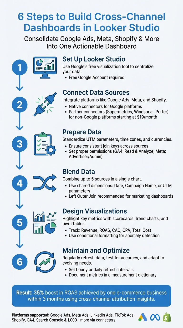
6-Step Process to Build Cross-Channel Marketing Dashboards in Looker Studio
Prerequisites and Tools You’ll Need
Required Tools and Accounts
To get started with Looker Studio, you’ll need a free Google Account. If you’re tracking data from Google’s native services like Google Analytics 4 (GA4), Google Ads, or Search Console, ensure those accounts are active and ready to connect.
For non-Google platforms such as Meta Ads (which includes Facebook and Instagram), LinkedIn Ads, TikTok Ads, or e-commerce tools like Shopify, you’ll need third-party connectors to import data. Tools like Supermetrics, Windsor.ai, Funnel, or Porter can handle this integration. For example, Windsor.ai offers automated connections starting at $19/month. Alternatively, you can manually export data as CSV files and upload them via Google Sheets – though this approach requires regular updates to stay current.
If you’re working with Instagram data, make sure your account is linked to a Facebook Business Manager account for complete access.
Preparing Your Data
Before diving into Looker Studio, take the time to prepare your data carefully. Standardizing UTM parameters (like source, medium, and campaign) across all your channels is key for accurate data merging. Also, align time zones and currency settings across every connected platform to avoid inconsistencies in your reports.
"Ensure your join key is consistent across sources; mismatched keys are the number 1 cause of discrepancies."
- Data Dashboard Hub
Check your permissions to ensure smooth access. For GA4, you’ll need at least "Read & Analyze" permissions for the property. In Meta Ads Manager, you’ll need "Advertiser" or "Admin" privileges. If you’re using a Google Ads Manager (MCC) account, you can pull data from up to 50 sub-accounts into a single data source. Once your data is standardized and permissions are sorted, you’re ready to log in to Looker Studio.
Accessing Looker Studio
Log in to Looker Studio and authorize data sources like Google Ads or BigQuery when prompted.
When setting up data sources, you’ll have two credential options: Owner’s Credentials or Viewer’s Credentials. Using Owner’s Credentials allows anyone to view the report without needing access to the underlying platform, while Viewer’s Credentials restrict access to users with platform permissions. To collaborate with your team, use the "Share" button to control who can view or edit the report based on their role.
Connecting and Integrating Data Sources
Using Native Connectors
Native connectors make it easy to bring in data from platforms like Google Ads, GA4, YouTube Analytics, or Search Console. Here’s how it works: choose your data source, grant the necessary permissions, select your account or property, and you’re good to go.
For Google Ads, you can combine all dimensions and metrics into a single list by selecting overall fields. If you’re managing multiple accounts under a Google Ads Manager (MCC) account, you can pull data from up to 50 sub-accounts into one source. Handling multi-currency setups? Use the currency drop-down to filter accounts, or let Looker Studio convert revenue fields to match your top-level MCC account’s currency.
Before adding the data to your report, you can rename fields, create calculated metrics, or adjust data types. Want to make your report more interactive? Add a Data Control component so viewers can switch between accounts as needed.
Partner Connectors for Non-Native Platforms
When dealing with platforms like Meta Ads, LinkedIn Ads, TikTok Ads, or Shopify, native connectors won’t cut it – you’ll need partner connectors like Supermetrics or Porter Metrics. Looker Studio’s connector gallery offers over 1,000 options for integrating non-native platforms. Using partner connectors involves a two-step process: first, authorize Looker Studio to use the connector, and then grant the connector access to the platform’s API .
To avoid login issues, make sure you’re signed into Looker Studio with the same email tied to your partner connector subscription. If you manage multiple Google accounts, clearing your browser cookies can help prevent auto-login errors. Many of these connectors also come with pre-built report templates. Choosing "Use report template for new reports" can save you the hassle of designing from scratch . For those exploring their options, Porter Metrics offers a 14-day free trial with no credit card required, and Supermetrics provides a trial period for new users.
Normalizing Data for Consistency
Different platforms often use unique names for the same metrics. For instance, Meta might call it "Amount Spent", while Google Ads refers to it as "Cost." To keep things consistent, use calculated fields to standardize these metric names. Similarly, you can use CASE statements to unify platform-specific channel names (like "facebook.com / paid_social" and "instagram.com / paid_social") under a single category, such as "Paid Social."
When blending data, rely on a shared dimension – like Date, Campaign Name, or UTM parameters – as your join key. To make the process smoother, label each data source descriptively. For example, instead of "Data Source 1", use something like "GA4 – Website Traffic" to eliminate confusion during blending.
Once your data is integrated and normalized, you’re ready to move on to blending and visualizing those combined insights.
Blending and Visualizing Data
Blending Data Across Channels
Looker Studio allows you to combine data from up to five different sources into a single chart or table. This is done using a join operator (which determines how records are combined) and a join condition (the fields that link the tables). For most marketing dashboards, a Left Outer Join is often the best choice – it keeps all rows from your primary data source while pulling in matching data from secondary sources.
The order of your tables matters. Looker Studio processes joins from left to right, applying the results of one join to the next table in sequence. If your join keys have formatting differences, you can fix them by creating calculated fields in the blend editor before performing the join.
It’s important to note that blends in Looker Studio are specific to the report they’re created in – you can’t reuse them across multiple reports. To keep your dashboard running efficiently, only include the fields you need for your visualizations. Apply date ranges and filters to individual tables within the blend editor (this is called "pre-blend") rather than applying them to the final chart ("post-blend"). This helps minimize the amount of data processed during the join.
When your data is properly blended, it provides a unified view across multiple channels. With this foundation in place, you can move on to creating visualizations that turn raw data into actionable insights.
Creating Key Visualizations
Start with scorecards for your most important metrics – things like Total Cost, Revenue, ROAS, CPA, and CAC. Place these in a prominent "hero" section of your dashboard. Include period comparisons to highlight how current performance measures up against previous periods or your goals.
For deeper insights, add elements that analyze data in more detail. Use time series charts to show trends over time, making it easier to identify patterns or anomalies. Pivot tables are another great tool – they let you break down performance by channel, device, campaign, or placement. To keep the view clean, use the optional metrics toggle, which allows users to add or remove specific columns like CTR, CPM, or reach as needed. If you’re blending scorecards, Looker Studio can automatically create ratio metrics, such as dividing "Cost" by "Clicks" to calculate CPC.
Conditional formatting is a powerful way to highlight anomalies or unusual trends. By flagging these issues directly in your dashboard, you turn it into more than just a reporting tool – it becomes an early warning system.
Building an Easy-to-Navigate Layout
Once your visualizations are ready, it’s time to structure your dashboard for easy navigation. Start with executive-level KPIs at the top, place trend charts in the middle, and include more detailed tables at the bottom. Stick to a consistent color scheme and use a small set of purposeful chart types, such as scorecards, time series charts, stacked bars, and pivot tables. This approach reduces visual clutter and makes your dashboard easier to interpret.
"Your marketing data is a chorus of voices – search, social, display, email, ecommerce – all singing at once. A Looker Studio dashboard turns that noise into a symphony you can conduct." – Tailored Edge Marketing
To make your dashboard interactive, use cross-filters. For example, clicking on a bar representing a specific marketing channel can automatically filter other visuals on the page to show only related data. Add controls for things like date granularity, currency, and attribution models so users can customize their views without needing to edit the report. For multi-page dashboards, organize the content by audience. Include an Overview page for executives, a Channel Performance page for managers, and a Creative/Placement page for analysts.
sbb-itb-2ec70df
Testing, Maintaining, and Optimizing Your Dashboard
Testing for Accuracy
Start by checking your dashboard metrics against the native user interface (UI) data from each source. Ensure that field IDs match precisely across all data sources to prevent filter issues across channels.
Keep things clear by documenting metric definitions, attribution windows, and refresh schedules in a measurement dictionary. This avoids confusion and ensures everyone understands the numbers the same way. To save time and catch problems early, set up an alert panel with conditional formatting. This can flag unusual trends like spikes in spend, surges in cost-per-acquisition (CPA), or sudden drops in conversions – no need to manually comb through the data.
"Establish a measurement dictionary that documents metric definitions, attribution windows, and refresh cadence – this prevents endless debates and ensures trust." – Tailored Edge Marketing
Switch to View mode and test all interactive features like date pickers, cross-filters, and drop-down menus to make sure they work as intended. Also, decide how you’ll handle credential management. Use "Owner’s credentials" if you want all users to see the same data, or "Viewer’s credentials" if each person needs their own access to the dataset.
Once you’ve confirmed accuracy, maintain reliability by scheduling regular data refreshes and checking connections consistently.
Regular Maintenance
Set up specific refresh intervals – whether hourly or daily – based on the needs of your data sources to ensure your dashboard stays up-to-date. Make it a habit to check connection statuses by navigating to Resource > Manage added data sources. This is especially important if the original data source owner leaves the organization, as someone with the right permissions will need to re-add the source.
Standardize time zones and currencies across all platforms to prevent mismatched totals. For example, if one source uses Pacific Time and another uses Eastern Time, your aggregated figures could be off. If you’re working with large cross-channel datasets, consider using the "Extract Data" connector or BigQuery to create pre-aggregated tables. This can significantly improve loading speeds and keep your dashboard running smoothly.
Optimizing for Better Insights
With accurate data and reliable maintenance in place, focus on refining your dashboard to meet evolving marketing needs. Gather feedback from users to tweak metrics and filters. Use the Manage Added Reports feature to review dependencies before making schema changes. If you update a field ID that’s already in use, remember to manually re-select the new field in every affected component.
For better performance with large datasets, switch from live connections to extracted data sources that update on a schedule. Lastly, revisit your attribution models and metric definitions as your marketing goals shift. A dashboard that worked six months ago might need adjustments to reflect new campaigns, channels, or business priorities.
How to Blend Ad Performance Data on Looker Studio for Cross-Channel Reports (2025)
Conclusion
Creating a cross-channel dashboard in Looker Studio transforms scattered data into a clear and actionable view. Instead of spending time on manual downloads, your team can access consolidated insights that show how your marketing channels work together. This shift allows your team to focus on analysis and strategy, rather than wasting hours managing data. With this unified perspective, you’re better positioned to drive meaningful business outcomes.
The results can be game-changing. For example, one e-commerce small business used Looker Studio to implement multi-channel attribution insights and achieved a 35% boost in Return on Ad Spend within just three months. By reallocating budget from underperforming channels to high-impact ones, they optimized their marketing strategy. Comparing attribution models, such as last-click versus linear, helped them pinpoint which touchpoints truly contributed to revenue, leading to smarter decisions.
But it’s not just about efficiency – it’s about seeing the full picture. Cross-channel dashboards offer a comprehensive view of the customer journey. You can track assisted conversions, combine online metrics with offline data from your CRM or point-of-sale systems, and build layered reports that cater to everyone – from executives needing high-level summaries to analysts diving into detailed performance metrics. This alignment ensures every stakeholder works with consistent, trustworthy data, enabling decisions that reflect a complete understanding of ROI.
To get started, focus on integrating key data sources, define a measurement framework upfront, and automate data updates to keep insights fresh. With regular maintenance and updates, these dashboards evolve alongside your marketing needs, turning real-time visibility into long-term growth opportunities.
FAQs
How can I maintain data consistency when blending sources in Looker Studio?
To keep your data consistent when combining sources in Looker Studio, focus on two key areas: matching fields accurately and choosing the right data. Make sure the fields used to connect data sources are correctly aligned and share compatible data types. This helps prevent errors or mismatches. Also, stick to including only the fields you truly need – extra, unnecessary data can slow down performance and make your dashboard harder to manage.
When working with multiple sources (up to five), it’s crucial to understand the relationships and join keys between your datasets. This ensures your data stays accurate and maintains its integrity. For manual blending, pick the relevant charts and fields, then use the "Blend data" option to create a cohesive view. By following these steps, you can build cross-channel dashboards that deliver consistent and trustworthy results.
What are the best practices for keeping a Looker Studio dashboard effective and up-to-date?
To keep your Looker Studio dashboard running smoothly and easy to use, focus on organization and simplicity. Arrange your data into logical groups and ensure filters and controls work seamlessly across all data sources. For instance, blending data from Google Ads and Google Analytics can give you a well-rounded view of marketing performance. Regular updates to your data sources and blending techniques are key to maintaining accuracy.
Automating data refreshes and setting up report sharing can save you time while keeping stakeholders updated with the most recent insights. Define clear KPIs and design your dashboard with a clean, consistent layout that suits your audience – whether it’s executives or team leaders. This makes decision-making more efficient. Lastly, test and tweak your dashboards regularly to make sure they stay aligned with your business goals and deliver actionable insights.
How do I integrate data from platforms like Meta and Shopify into Looker Studio?
To bring data from platforms like Meta (Facebook Ads, Instagram Ads) and Shopify into Looker Studio, third-party data connectors or integration tools can simplify the process. These tools automate data importing and syncing, allowing you to visualize and analyze cross-channel performance in one streamlined dashboard.
Looker Studio also lets you set up custom data sources to connect with external platforms. By configuring field mappings and applying filters, you can merge data from multiple sources for unified reporting. For more advanced needs, consider tools that offer direct connections or use intermediary formats like spreadsheets or databases to make the integration process smoother.