

Email heatmaps are tools that visually show how users engage with your emails. They highlight where people click, how far they scroll, and which areas grab attention. By analyzing this data, you can improve email design, focus on high-performing elements, and reduce areas of low engagement. Here’s what you need to know:
- Types of Heatmaps:
- Click Heatmaps: Show where users click most.
- Scroll Heatmaps: Reveal how far users scroll.
- Engagement Timing: Measure how long users interact with your email.
- Why They Matter: Heatmaps go beyond basic metrics like open rates. They help identify effective content placement, improve call-to-action (CTA) performance, and fix design issues like "rage clicks" on non-clickable elements.
- Key Insights:
- Place CTAs in high-engagement areas (red zones).
- Shorten emails if scroll data shows drop-offs.
- Ensure mobile-friendly designs with single-column layouts and large, tappable buttons.
- Using Heatmaps: Combine heatmap data with A/B testing and other metrics to refine email strategies. For example, tracking clicks with unique UTM parameters can reveal which elements drive the most engagement.
Heatmaps provide actionable insights to create emails that engage readers and drive better results.
Walkthrough: Email Analytics
Types of Email Heatmaps
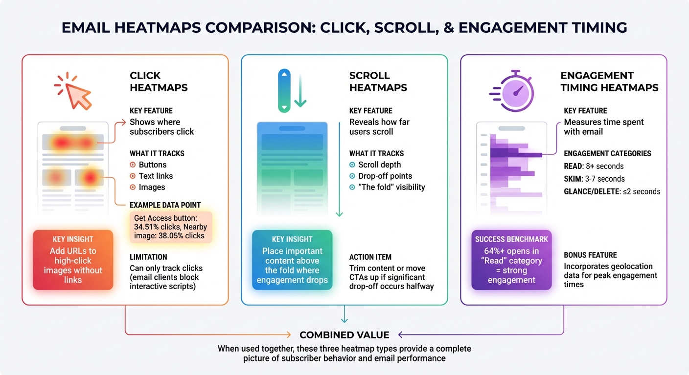
Three Types of Email Heatmaps and Their Key Insights
Email heatmaps come in three main types – click, scroll, and engagement timing – each providing distinct insights into how subscribers interact with your emails. When combined, these heatmaps help paint a detailed picture of subscriber behavior, allowing you to refine your email design and content strategy.
Click Heatmaps
Click heatmaps show exactly where subscribers are clicking within your emails. Areas with the most activity are marked in red and orange, while less active zones appear in blue and green. These maps track clicks on buttons, text links, and images, giving you a clear sense of what grabs attention and drives action.
For instance, in one campaign, a "Get Access" button attracted 34.51% of clicks, while a nearby image received 38.05%. If images in your emails consistently draw clicks but don’t include links, adding a URL could capture more of that engagement.
It’s worth noting that email heatmaps can only track clicks, as email clients block interactive scripts. Even so, click data remains a reliable measure of engagement, especially when open rates are skewed by features like Apple’s Mail Privacy Protection.
Next, scroll heatmaps help you understand how far readers make it through your email content.
Scroll Heatmaps
Scroll heatmaps reveal how much of your email subscribers actually scroll through, highlighting where they stop reading. This data helps you decide on the ideal email length and where to place key content. If you notice a significant drop-off halfway through your email, it might be time to trim the content or move important information closer to the top.
These maps also highlight the "fold" – the section of your email visible without scrolling. This area is prime real estate for your most important message. For example, if your secondary call-to-action (CTA) is buried near the bottom and scroll data shows few people are seeing it, consider moving it above the fold or removing it altogether to keep your email clean and focused.
Engagement Timing Heatmaps
Engagement timing heatmaps measure how long subscribers spend with your email, categorizing their interactions as "Read" (8+ seconds), "Skim" (3–7 seconds), or "Glance/Delete" (2 seconds or less). In successful campaigns, at least 64% of email opens fall into the "Read" category, signaling strong engagement.
These heatmaps can also incorporate geolocation data to identify peak engagement times in different regions. By pinpointing when your audience is most active, you can schedule emails to land in inboxes during those high-engagement windows. This timing data, when paired with other heatmap insights, offers a well-rounded understanding of how your emails perform and where there’s room for improvement.
How to Read Email Heatmap Data
Finding High and Low Engagement Areas
Email heatmaps use a color-coded system to show where your subscribers are focusing their attention. Zones marked in red and orange highlight areas of high engagement, while blue and green areas signal low interaction or "cold spots". This visual approach helps you quickly identify patterns in user behavior.
Look closely at the click percentages on your heatmap to understand how engagement is distributed. Comparing your data to industry benchmarks can help you determine if your hot and cold zones are in line with typical performance. If something looks off, it could be a chance to make improvements.
Pay special attention to repeated clicks on non-linked images or text. These clicks suggest that subscribers expect those elements to be interactive. Adding links to these areas could better capture their interest. Similarly, if an area gets a lot of clicks but no conversions, it might point to a broken link or another technical issue.
Scroll depth analysis is another valuable tool. It shows where readers lose interest and stop engaging with your email. If engagement drops significantly halfway through, your email might be too long, or your key information could be buried too deep. To address this, move your most important call-to-action (CTA) elements into the high-engagement "hot zones" and consider trimming content that falls below the drop-off point.
Once you’ve identified these patterns, take it a step further by analyzing how different subscriber segments interact with your email.
Analyzing Data by Subscriber Segments
Segmenting your heatmap data can uncover how different groups of subscribers engage with your emails. For example, breaking it down by device type often reveals distinct patterns. Mobile users tend to skip over right-hand columns or elements that require too much scrolling, while desktop users usually engage more evenly across the layout. If your mobile heatmap shows cold spots in areas that perform well on desktop, it might be time to simplify your design into a single-column, thumb-friendly layout.
Examining email client data can also highlight rendering issues that might be affecting engagement. For instance, if Outlook users show a cold spot where Gmail users see a hot zone, it could mean a button or layout isn’t displaying properly in Outlook. Fixing these issues can help prevent lost conversions caused by technical glitches.
Geolocation data adds another layer of insight, showing regional differences in content preferences and ideal send times. If heatmaps reveal that certain types of content perform better in specific regions, you can use this information to tailor future campaigns.
Additionally, comparing unique clicks to total clicks within segments can help you distinguish between general interest and deeper engagement. A large gap between the two might indicate either strong interest or user confusion. Pair this with engagement timing data – which tracks whether users spend 8+ seconds reading or just glance at the content for under 2 seconds – to get a clearer picture.
Integrating these insights with your standard metrics can give you a more complete understanding of your email performance.
Combining Heatmap Data with Standard Metrics
While metrics like open rates and click-through rates provide a broad view of your campaign’s performance, heatmaps show exactly where those interactions occur.
"Email heatmaps don’t just show you what’s working, they show you where it’s working."
– Susmit Panda, Content Writer, Email Mavlers
Heatmaps also solve a common issue with many email service providers: duplicate link tracking. ESPs often lump together clicks for the same URL, no matter where it appears in the email. By adding unique UTM parameters (like ?link=top_button vs. ?link=footer_button), you can track each placement separately and see which one drives more engagement.
They’re also great for identifying which design elements are performing well and for validating A/B test results.
| Metric Type | Pros | Cons |
|---|---|---|
| Standard Metrics (Open/CTR) | Easy to track; shows ROI and overall trends. | Doesn’t provide spatial context; can’t differentiate between multiple instances of the same link. |
| Heatmap Data | Visualizes user behavior; highlights design flaws and "dead zones"; shows link placement effectiveness. | Doesn’t track scrolling depth or mouse hovering due to email client restrictions. |
| Engagement Timing | Adds context to opens by showing if users truly engage with the content. | Can be skewed by Apple’s Mail Privacy Protection (MPP). |
Keep in mind that Apple’s Mail Privacy Protection has inflated open rates since 2021, making click-to-open rates less reliable. However, heatmap click tracking remains accurate because it measures actual link engagement, not just opens. This makes heatmap data an increasingly valuable tool as privacy features evolve.
sbb-itb-2ec70df
Email Design Optimization Techniques
Placing CTAs and Key Content
Understanding your email’s hot zones is key to maximizing engagement. Place primary CTAs and high-value offers in the red and orange areas of your heatmap – these are the spots where subscribers naturally focus their attention.
The inverted pyramid approach is a great way to guide readers. Start with a bold headline, follow it with engaging visuals, and position your main CTA button at the end of this visual flow. If your heatmap shows 30% to 40% of clicks going to your primary banner, it’s a sign your design and messaging are working.
Subscribers often click on images, assuming they’re linked. Make sure any high-engagement visuals, like product photos, hyperlink to relevant landing pages. To measure performance, use unique tracking parameters for each CTA.
Cut out distractions like unnecessary social icons, logos, or secondary links that might pull attention away from your primary CTA. Keep the number of clickable elements to a minimum so subscribers stay focused.
| Email Section | Expected Click Distribution | What to Do |
|---|---|---|
| Primary Banner | 30% – 40% | Redesign or tweak copy if below 30% |
| Email Body | 40% – 50% | Link all product images |
| Email Footer | 10% – 20% | Use for secondary links only |
| Single Ad (Brief Email) | 70% – 80% | Remove competing CTAs |
Once your CTAs and focal points are optimized, the next step is to refine your content layout to make it more reader-friendly.
Structuring Content for Better Readability
Most subscribers don’t read emails – they scan them. With an average viewing time of just 8 seconds, your email layout needs to help readers absorb key information quickly.
For content-heavy emails, such as newsletters, a Z-pattern layout works well. This design naturally directs the reader’s eyes across multiple sections, making it perfect for showcasing testimonials or highlighting several products.
Always place your most important information at the top. Heatmaps consistently show that content requiring too much scrolling gets far less attention. If your data reveals a drop in scroll depth halfway through the email, either trim the content or reposition critical offers higher.
To make scanning easier, use bullet points, numbered lists, and bold text. This is especially important since 63% of emails are opened on mobile devices, where smaller screens make a clean, structured layout even more essential.
Once your layout is scanning-friendly, focus on optimizing it for mobile users to ensure a seamless experience across devices.
Designing for Mobile Devices
Mobile heatmaps provide valuable insights into user behavior. Unlike desktop users, mobile readers tend to ignore right-hand columns and lose interest quickly with excessive scrolling. A single-column layout that stacks content vertically is ideal for mobile screens.
Pay attention to tap behavior on mobile devices. Buttons should be large enough and spaced apart to avoid accidental clicks on touchscreens. If you notice users repeatedly tapping on non-linked images, consider hyperlinking those visuals to improve engagement.
If mobile scroll data shows a significant engagement drop after the first section, shorten your content or move key CTAs higher to boost conversions. For instance, one retailer repositioned their "Complete Purchase" button to a higher spot based on scroll heatmap data and saw a 15% increase in conversions.
Using Heatmaps for Ongoing Improvement
Testing Email Variations
Heatmaps go beyond just showing which version of an A/B test performs better – they help uncover why one version wins or loses. They can reveal if subscribers are overlooking a new call-to-action (CTA) or if secondary images are pulling their attention away from the main message.
To get clear insights, test one element at a time, like the placement of a CTA or the color of a button. For reliable results, aim for a sample size of 1,000–5,000 subscribers per group.
Timing also plays a big role in test accuracy. For click-based metrics, wait at least 3 hours to achieve about 90% accuracy. For revenue-based decisions, let the test run for 24 hours. Don’t forget to check heatmaps for signs of frustration, like rage clicks – repeated clicks in one spot often indicate broken links or elements that look clickable but aren’t.
Tracking Engagement Patterns Over Time
Heatmaps aren’t just for one-off tests – they’re great for spotting trends in subscriber behavior over time. By analyzing heatmaps monthly, you can track how engagement shifts across different types of emails, like newsletters, product announcements, or sales promotions. This helps identify which layouts consistently work best for specific goals.
Use engagement thresholds to better understand how subscribers interact with your emails: a Read Rate (8+ seconds), a Skim Rate (3–7 seconds), and a Glance/Delete Rate (under 2 seconds). If your Read Rate starts to drop across multiple campaigns, it might be time to rethink your content strategy.
Device consistency matters too. For instance, if mobile engagement dips while desktop engagement stays strong, you’ll know where to focus your efforts. Heatmaps segmented by audience groups can also reveal useful insights – like younger subscribers engaging more on mobile, while B2B audiences may prefer desktop interactions.
Connecting Heatmaps to Broader Marketing Strategies
When heatmap insights are combined with other marketing data, they become even more impactful. For example, comparing email heatmap data with landing page bounce rates can show if your email message aligns with the experience subscribers get after clicking through. If your email promotes a specific offer but the landing page doesn’t deliver on that promise right away, heatmaps and bounce rates will highlight the disconnect.
Growth-onomics takes this approach by using heatmap data to enhance customer journey mapping and performance marketing. They help businesses pinpoint where subscribers drop off and create strategies to re-engage them across multiple touchpoints.
You can also use heatmaps alongside geolocation data to improve timing. If certain regions show higher Read Rates at specific times, you can adjust your email send schedules to match. This kind of cross-channel analysis turns heatmaps into a powerful tool for long-term strategy, not just single campaigns.
Conclusion
Email heatmaps offer a powerful way to understand how subscribers interact with your messages. They go beyond basic metrics like open rates or click-through rates, showing you which calls-to-action (CTAs) resonate, which images draw attention, and which parts of your email might be getting ignored.
The real advantage of email heatmaps lies in their ability to guide continuous improvement. As Melissa Berdine from Email on Acid explains:
"Audience data and analytics are the key to progress and improvement. Use that key to behavioral insights to keep your brand and emails constantly evolving".
What worked yesterday might not work tomorrow, which is why ongoing testing and fine-tuning are essential. This process connects tactical experiments with broader strategic goals.
For businesses focused on growth – like those collaborating with Growth-onomics – email heatmaps are an essential tool for creating a data-driven marketing strategy. When combined with tools like engagement thresholds, device-specific insights, and customer journey mapping, heatmaps provide a clearer picture of how subscribers interact with your content. This comprehensive perspective helps pinpoint trouble spots early, ensuring your email campaigns stay in sync with changing user behaviors.
To make the most of these insights, start small. Test one element at a time – such as adjusting CTA placement, improving image interactivity, or rethinking your content layout. Measure the results, apply what you learn, and repeat the process. Over time, these small, consistent tweaks can lead to noticeable improvements in engagement and campaign performance.
FAQs
How do email heatmaps help improve email campaign performance?
Email heatmaps use color-coded overlays to show which parts of your email grab the most attention. Hot zones (red/orange) highlight areas of high engagement, like frequently clicked headlines or buttons, while cold zones (blue/green) point to sections that users tend to ignore. This visual data makes it easier to pinpoint what’s working and what isn’t.
By studying these patterns, you can adjust your email layout to get better results. For example, you might move key calls-to-action (CTAs) to areas with higher engagement, tweak underperforming sections, or test new designs to lift your click-through rates (CTR). Heatmaps also reveal user behavior across devices, like desktop versus mobile, helping you design emails that look and perform great no matter where they’re opened.
At Growth-onomics, we use heatmap analytics to deliver tailored recommendations. Our goal? To help you fine-tune your email campaigns, increase engagement, and get the most out of every marketing effort.
What’s the difference between click, scroll, and engagement timing heatmaps in email analytics?
Click heatmaps pinpoint exactly where users click or tap in an email, showing which links or buttons grab the most attention. Scroll heatmaps illustrate how far down users scroll, giving a clear picture of which sections of the email are actually viewed. Engagement timing heatmaps shed light on how long users spend on specific content, offering valuable insight into what holds their attention and interest the longest.
How can I combine heatmap data with other email marketing metrics for better insights?
Combining heatmap data with key email marketing metrics can open the door to actionable insights and better audience engagement. Start by matching heatmap click zones with metrics like open rates, click-through rates (CTR), and conversion rates. While heatmaps tell you where users are clicking, CTR shows how many clicks are happening. This pairing can help you pinpoint high-performing areas, like an attention-grabbing CTA button, or reveal underperforming spots that might need a tweak.
Take it a step further by analyzing heatmap data across audience segments, such as new versus loyal subscribers, and compare it with metrics like average order value or lifetime value. For instance, if a specific segment frequently clicks on a product link but doesn’t convert, the problem might be in the post-click experience – perhaps the landing page isn’t meeting expectations.
Finally, let these insights guide your A/B testing efforts. For example, you might move a CTA from a "cold" zone to a "hot" zone and set a clear goal, like increasing your CTR from 2.3% to 3.5% within 30 days. Track the results to see the impact and adjust your strategy as needed. By blending heatmap data with broader metrics, you can make smarter, data-driven decisions that boost email performance and foster growth.