

Compliance dashboards simplify how organizations track and manage regulatory requirements by consolidating data into visual, easy-to-read formats. Customization is key to tailoring these dashboards to specific business needs, whether for healthcare, finance, or other industries. Here’s what you need to know:
- Purpose: Dashboards provide real-time insights into compliance status, flag risks, and monitor deadlines.
- Customization: Align metrics with your organization’s regulatory frameworks (e.g., HIPAA, GDPR, SOC 2) and user roles (executives vs. compliance officers).
- Key Metrics: Track indicators like training completion rates, risk severity, and audit readiness.
- Tools: Choose platforms that integrate with existing systems, offer real-time updates, and allow for role-based access.
- Design: Use clear layouts, color-coded visuals, and logical groupings of metrics for quick decision-making.
A well-designed compliance dashboard ensures teams can address risks efficiently, meet regulatory demands, and prevent costly penalties. From defining goals to selecting tools and refining layouts, these steps make compliance tracking more effective and actionable.
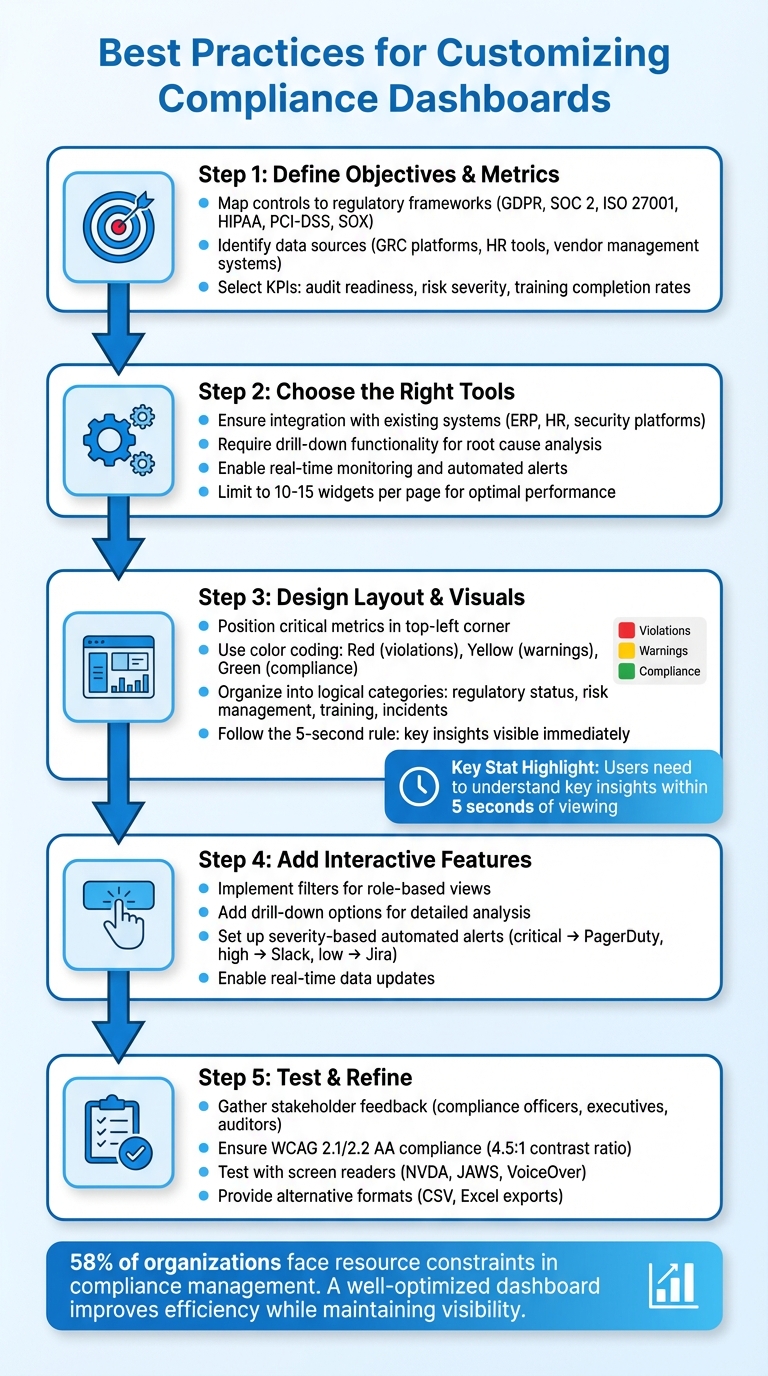
5-Step Process for Customizing Compliance Dashboards
Creating Your Own Custom Compliance Dashboard
Define Your Dashboard Objectives and Key Metrics
Before diving into building a dashboard, it’s crucial to define its purpose. Are you gearing up for an audit? Keeping an eye on organizational risks? Or maybe ensuring compliance with specific regulations? Your goal will guide which metrics deserve your attention. For example, a dashboard tailored for audit readiness will look entirely different from one designed for monitoring real-time risks. Once your objectives are clear, align them with your business and regulatory data sources to ensure meaningful insights.
Identify Business and Compliance Requirements
Start by mapping your controls to the relevant regulatory frameworks, such as GDPR, SOC 2, ISO 27001, HIPAA, PCI-DSS, or SOX. Each of these has its own unique focus. GDPR emphasizes data privacy and breach response times, while SOC 2 is centered on control implementation and security practices. If you’re in healthcare, HIPAA requires tracking patient data access, whereas financial institutions need to monitor transactions for anti-money laundering (AML) compliance.
Next, identify the systems where your compliance data resides. This might include GRC platforms, HR tools for tracking training completion, vendor management systems, and security tools. Knowing where your data lives is essential to figuring out what’s measurable. A centralized dashboard can bring all these data sources together, offering a consolidated view that simplifies tracking and resource management. This unified perspective helps you pinpoint the KPIs that matter most for audit readiness and risk management.
Select Key Metrics to Track
The metrics you choose should directly influence business decisions. Focus on indicators that highlight critical gaps or risks. For audit readiness, this might mean tracking document completion rates or audit schedules. For risk management, you’d want to monitor risk severity and the progress of mitigation efforts. If building a compliance culture is your goal, keep an eye on training completion rates and policy acknowledgments.
Once you’ve identified where your data is stored, you can zero in on the most impactful indicators. Tailor your metrics to your audience. Executives benefit from high-level insights, like risk scores and compliance trends over time. Operations teams, on the other hand, need actionable details, such as active violations ranked by severity, specific resource failures, and Mean Time to Remediate (MTTR). Developers might prefer team-specific dashboards that highlight resources under their control needing immediate attention.
A practical strategy is to set Service Level Objectives (SLOs) for compliance. For example, you might aim for 99.9% of critical resources to remain compliant at any given time. This approach establishes a clear benchmark, translating technical compliance into terms that resonate across the organization.
Choose the Right Tools and Platforms
When setting up your compliance dashboard, it’s not just about aesthetics. The tool you choose must seamlessly integrate with your existing systems, provide real-time insights, and grow alongside your compliance demands. Aligning the platform’s technical capabilities with your metrics and objectives is the key to success.
Evaluate Features and Scalability
Your platform should act as a central hub, pulling data from all your compliance-related systems – think ERP software, HR tools, document management systems, security platforms, and external regulatory databases. Without this integration, your insights will feel disjointed, leaving you without a full picture. A must-have feature? Drill-down functionality. This allows users to click on high-level metrics and dive into the details – whether it’s specific activities, underlying data, or supporting documentation. This is crucial for root cause analysis and gathering evidence during audits.
Real-time monitoring and automated alerts are equally important. These features ensure you’re always one step ahead of regulatory changes or deadlines, notifying the right people immediately when risks arise or compliance thresholds are exceeded. Granular access controls are another essential feature, safeguarding sensitive data by allowing only authorized personnel to view or edit it. As highlighted by the U.S. Department of Justice:
"Do compliance and control personnel have sufficient direct or indirect access to relevant sources of data to allow for timely and effective monitoring and/or testing of policies, controls, and transactions?"
Performance is another critical factor, especially as your data grows. To keep your dashboards running smoothly, stick to 10–15 widgets per page. Need more visibility? Break information into multiple tabs rather than overwhelming a single screen. Also, ensure the platform supports exporting data into PDF or Excel formats for presentations or audits.
Consider Usability and Adaptability
While performance is vital, ease of use can’t be overlooked. Your platform should be intuitive and user-friendly. Look for tools that offer customizable views and mobile access to compliance data. Users should be able to tweak visual layouts, switch between chart types (like pie charts and bar graphs), and create department-specific views – all without needing IT assistance. This flexibility is especially important for non-technical compliance officers who need to adjust dashboards as reporting requirements change.
As regulations evolve – whether it’s updates to GDPR or new financial standards – your platform must keep up without requiring a complete overhaul. Opt for a system designed to accommodate future updates and innovations. This will save you from expensive migrations and keep your compliance processes running smoothly as the landscape shifts.
Design Your Dashboard Layout and Visual Elements
Once you’ve chosen a platform, the next step is to design a dashboard layout that provides critical insights at a glance. This isn’t just about making it look good – it’s about creating a tool that helps users make quick, informed decisions. Stephen Few, a recognized expert on dashboards, defines them as “a visual display of the most important information needed to achieve one or more objectives that has been consolidated on a single computer screen so it can be monitored at a glance”. With attention spans averaging around just eight seconds, your dashboard needs to deliver insights fast. This phase combines your defined metrics and selected tools to create a clear, actionable display.
Organize Metrics for Easy Reading
A well-organized layout enhances decision-making by visually prioritizing data. Group your metrics into logical categories, such as:
- Regulatory status: GDPR and HIPAA compliance scores
- Risk management: Key risk indicators and progress on mitigation
- Training progress: Completion rates and policy acknowledgments
- Incident tracking: Open violations and resolution times
Position the most important metrics in the top-left corner, as this is where users naturally look first. Then, arrange data from top-left to bottom-right based on priority – start with high-level insights, follow with trends for context, and finish with detailed tables. A good dashboard should answer key business questions within five seconds of viewing. To keep it functional and visually clean, stick to 10–15 widgets per page. If you need to include more data, use multiple tabs instead of cramming everything onto one screen.
Use Visual Hierarchies
A clear visual hierarchy helps users focus on what matters most. Larger visuals should highlight key performance indicators (KPIs), like an overall compliance score, while smaller elements can display supporting data. Use color with purpose – don’t overdo it. Bright colors should signal critical information: red for violations, yellow for warnings, and green for success or compliance. Neutral tones for the rest of the dashboard reduce visual fatigue.
Font hierarchy is another powerful tool. Use bold fonts and larger sizes for headings and key data points to make them stand out. Simplify numerical data by rounding to one or two decimal points and scaling large numbers – for example, display "5.2M" instead of "5,200,000". Incorporating white space is equally important. It prevents clutter and ensures that critical metrics are easy to spot.
Single-Page vs. Multi-Tab Layouts
The choice between a single-page or multi-tab layout depends on your audience and the complexity of the data.
- Single-page layouts work well for executives who need a quick snapshot of overall compliance. They follow the five-second rule and eliminate extra clicks. However, they can become cluttered with more than 15 widgets, and performance may decline with large datasets.
- Multi-tab layouts are better for handling complex or detailed data. They allow for deeper analysis and logical separation – such as creating separate tabs for "Training" and "Risk Management." The downside is that users may need to navigate through tabs to access critical information.
Here’s a quick comparison:
| Feature | Single-Page Layout | Multi-Tab Layout |
|---|---|---|
| Best For | Executive summaries and quick overviews | Detailed analysis across departments |
| Pros | Instant visibility, no extra clicks | Reduced clutter, better performance |
| Cons | Slower performance with too many widgets | Important data may require extra navigation |
| User Type | Executives and senior leadership | Compliance officers and technical analysts |
If your compliance team works across multiple frameworks and departments, a multi-tab layout offers the flexibility they need. On the other hand, if your board of directors needs a concise quarterly report, a single-page design delivers the clarity they’re looking for.
sbb-itb-2ec70df
Add Interactive and Automated Features
A static dashboard gives you a snapshot of where things stand. But an interactive, automated dashboard takes it a step further by turning passive data into actionable insights and timely alerts. This creates a dynamic system that not only tracks compliance but actively supports your strategy. These tools allow teams to respond more quickly and explore data more effectively.
Add Filters and Drill-Down Options
Filters and drill-down features let users customize their view and investigate specific issues without overwhelming the main dashboard. Instead of cramming every detail onto one screen, you can design layered views. Start with a high-level summary of trends, then use drill-down options to uncover detailed insights and actionable data.
For instance, a compliance officer could click on a red "GDPR Violations" metric to see specific incidents broken down by department or geographic location. This method keeps the interface clean while still offering stakeholders the depth they need. Filters also allow different roles to focus on what matters to them. Executives might sort data by compliance frameworks like ISO 27001 or GDPR, while department heads could filter by their teams. This flexibility is essential, especially when 65% of organizations face challenges tracking compliance across multiple jurisdictions.
While filters help refine what users see, automated alerts ensure that urgent issues don’t go unnoticed.
Set Up Automated Alerts and Real-Time Updates
Interactive dashboards become even more powerful when paired with automated alerts and real-time updates. These alerts act as an early warning system, ensuring the right people are notified at the right time. As AuditBoard explains:
"When configured effectively, reporting dashboards act as an alarm system alerting your team to emergencies in addition to tracking the progress of compliance day to day".
The key is to make alerts actionable. Each notification should include clear details: which policy was violated, what resource is affected, why it failed, and how to address it. Links to runbooks or relevant documentation can streamline the resolution process.
Use severity-based alerts to prioritize responses. For example, critical issues, such as a high-risk vulnerability nearing its remediation deadline, can be sent directly to on-call engineers via tools like PagerDuty. High-priority alerts might go to team chat platforms like Slack or Microsoft Teams, while lower-priority issues could be logged in Jira for review later. To avoid overwhelming users, group alerts by policy or resource ID instead of sending a separate notification for every system check.
Real-time data updates are especially critical in industries like finance and healthcare, where quick breach detection can prevent severe penalties. For most organizations, weekly updates strike a good balance between staying informed and managing resources. However, more stable environments might only require monthly or quarterly updates.
Test, Refine, and Ensure Accessibility
Creating an interactive dashboard is just the beginning; the real value comes from testing and refining it to meet the needs of all users. Skipping this step can result in a tool that frustrates users or excludes those relying on assistive technologies.
Gather Stakeholder Feedback
To refine your dashboard effectively, start by identifying key stakeholders. These typically fall into three groups: primary users like compliance officers, secondary users such as executives, and tertiary users like auditors or industry experts. Engage them with targeted questions such as, "What does success look like for you?" or "What risks or obstacles concern you?" to better understand their priorities.
Create dedicated feedback channels where users can raise concerns or ask questions. Embedding surveys directly into the dashboard is another way to gather real-time input, especially on accessibility or device-related challenges. For prioritizing features, consider structured exercises like "buy a feature", where stakeholders allocate limited resources to the metrics they value most. This method ensures that your focus aligns with what matters most – especially when 58% of organizations already face resource constraints in compliance management.
Maintain regular communication with stakeholders through weekly or bi-weekly check-ins. After major discussions, document decisions, assign action items to specific owners, and set clear timelines. As Mural emphasizes:
"Stakeholders respect consistency more than ambition without follow-through".
Fix Data Accuracy and Common Issues
A dashboard is only as good as its data. Integration challenges across various sources often lead to inaccuracies, so implement real-time monitoring and automated workflows to catch inconsistencies early. For dashboards with over 1,000 data points, switching from browser-side to server-side rendering can cause accessibility issues, such as breaking WCAG compliance. To avoid this, streamline your visualizations by limiting data density and organizing content into smaller, focused tabs like Overview, Audit Issues, and Regulatory Updates.
Accessibility testing is equally critical. Ensure screen readers follow a logical order by manually adjusting the element hierarchy where necessary. Automated tools like axe DevTools or Lighthouse can help with initial audits, but always follow up with manual testing using screen readers like NVDA, JAWS, or VoiceOver.
Meet Accessibility Standards
A truly effective dashboard balances functionality with accessibility. Aim for WCAG 2.1 or 2.2 AA compliance to ensure usability for individuals with diverse needs. This includes maintaining contrast ratios of at least 4.5:1 for standard text and 3:1 for larger text (18pt or 14pt bold).
Offer alternative data formats such as CSV or Excel exports, which are more compatible with assistive technologies than visual dashboards. Use semantic HTML elements like <header>, <nav>, and <main> to establish a clear content structure. For non-urgent updates, implement ARIA live regions (aria-live="polite") so screen readers can announce changes without disrupting the user experience. As GoodData puts it:
"Accessibility is not just about meeting compliance standards. It is about creating dashboards that are clearer, easier to use, and more enjoyable for everyone".
During the design phase, test your color choices by simulating colorblindness (e.g., tritanopia) using browser extensions or developer tools. Incorporate pattern fills, distinct shapes, or text labels to help users with color-vision deficiencies distinguish data points. Some platforms even include an "Accessibility Mode" that disables non-accessible elements and embeds raw data tables into PDF exports, making dashboards more inclusive without compromising functionality.
Conclusion
Review of Best Practices
Creating effective compliance dashboards starts with a clear plan. Begin by defining your goals: Do you need a high-level overview for executives, a detailed tool for compliance officers, or a practical dashboard for department managers? Each option serves a unique purpose and offers distinct insights from your data.
The technical setup is just as crucial as the layout. Gather all your data into one centralized view to ensure it’s actionable. Use a visual hierarchy – place critical metrics in the top-left corner and incorporate color-coded indicators (red, yellow, green) to quickly highlight pressing issues.
Functional features are equally important. Include drill-down options for deeper analysis, automated alerts to track deadlines, and robust security measures like multi-level authentication to safeguard sensitive information. Mobile optimization is another must-have, enabling stakeholders to access data on the go. As Michael Volkov, CEO of Volkov Law Group, explains:
"A compliance dashboard should show you key metrics at a glance to clearly understand the health of your program".
By integrating these elements, your dashboard becomes more than a tool – it turns into a powerful resource that simplifies compliance management and drives meaningful results.
Using Compliance Dashboards for Business Success
When built with care, compliance dashboards become strategic assets. They’re not just about meeting regulatory requirements – they help you avoid costly mistakes. For example, Capital One faced a $390 million penalty for inadequate AML monitoring, while Goldman Sachs incurred a staggering $3.9 billion settlement for compliance failures. A well-designed dashboard can help you steer clear of such outcomes by identifying risks early and providing actionable insights.
To stay effective, your dashboard needs regular updates. Audit for gaps, gather user feedback, and adjust to evolving regulations. With 58% of organizations citing resource limitations in compliance management, a well-optimized dashboard can make your team more efficient while maintaining visibility across departments and regions. Customization ensures reduced risks and quicker decision-making, laying the foundation for a compliance program that truly delivers.
FAQs
How can I customize my compliance dashboard to meet regulatory requirements like GDPR or HIPAA?
To make sure your compliance dashboard meets the standards of frameworks like GDPR or HIPAA, start by pinpointing the key requirements of the regulation and converting them into measurable metrics. For GDPR, focus on tracking things like data subject access request (DSAR) response times, consent record accuracy, and cross-border data transfers. For HIPAA, pay attention to metrics such as access control violations, audit log completeness, and encryption coverage.
Bring together data from relevant sources, including cloud providers, identity management systems, and privacy tools. Leverage monitoring platforms to automatically flag issues when metrics exceed regulatory thresholds. Design your dashboard to emphasize critical metrics, risk scores, and remediation statuses, so compliance is straightforward and easy to monitor at a glance.
Lastly, enforce strict governance by using role-based access controls, maintaining audit logs, and automating compliance reporting. This ensures your dashboard remains a dependable tool for showcasing ongoing alignment with GDPR, HIPAA, or other regulatory requirements.
What should I look for in a platform to create an effective compliance dashboard?
When choosing a platform for your compliance dashboard, focus on features that transform complex regulatory data into clear, actionable insights while remaining easy to use and flexible enough to meet your specific needs.
Look for real-time data integration, automatic regulatory updates, and tools to track key performance indicators (KPIs) and key risk indicators (KRIs). Features like threshold-based alerts, drill-down capabilities, and AI-powered analytics can help you stay ahead of potential risks and address them efficiently.
Customizability is also essential. A platform with options like drag-and-drop widgets, flexible filters, and role-based views allows you to tailor the dashboard to suit your team’s workflow. Don’t overlook security – strong measures such as encryption, access controls, and audit logs are vital to protect sensitive compliance data. Finally, ensure the platform has a scalable design to accommodate your business as it grows and adjusts to changing regulatory demands.
How can I create a compliance dashboard that supports fast decision-making?
To create a compliance dashboard that supports swift decision-making, start with a user-friendly layout and a well-defined visual hierarchy. Position the most critical metrics – like risk scores, pending violations, and regulatory deadlines – in the top-left corner, as this is where users’ eyes naturally gravitate. Keep the design clean by using plenty of whitespace, a neutral color scheme, and consistent fonts and icons. This approach minimizes distractions and ensures the data is easy to understand at a glance.
Structure the dashboard into three main sections for clarity:
- Headline KPIs: Display single-value metrics that give a quick snapshot of overall compliance health.
- Trends: Use charts or graphs to show performance patterns over time, such as the last 30 days or a quarterly view.
- Details: Include tables or heatmaps for a more granular analysis, breaking down data by region, business unit, or specific regulations.
At the top of the dashboard, add filters for parameters like date ranges or regulation types, allowing users to customize their view. Incorporate color-coded alerts to draw attention to metrics that exceed set thresholds, making it easier for decision-makers to spot priorities and act promptly. Growth-onomics can help you design a tailored dashboard that seamlessly integrates your data and aligns with your compliance objectives.