


Ask a paid media manager how a campaign is performing, and you will get a cost per lead.
Ask a CFO whether that campaign is working and you will get a different question entirely.
The gap between those two conversations is not a reporting problem. It is that cost per lead answers a question nobody in the business actually has.
A campaign can halve its CPL by finding people who will fill in a form and never buy anything, and every weekly report will celebrate the improvement for a quarter before anyone notices that the pipeline did not move.
Meanwhile, the metrics that would have predicted the outcome were available the whole time. Some of them sit inside the ad platform. Several require joining spend to CRM data, which is a project rather than a setting. A few are behavioral and cost nothing to start tracking today.
These 10 predict closed-won revenue better than CPL does, ordered roughly from earliest signal to most conclusive. Each one states what it measures, how to build it, what the signal looks like, and where it misleads because every metric on this list can be gamed, and a few of them are gamed routinely without anyone intending to.
Why CPL Predicts So Poorly
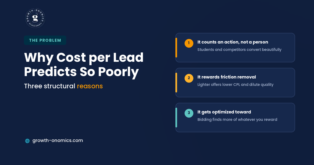
3 structural reasons, and understanding them explains why the alternatives are constructed the way they are.
It counts an action, not a person. A form submission is a behavior almost anyone will perform for a sufficiently appealing offer. Students, competitors, consultants, and job seekers all convert at excellent rates, and the metric cannot distinguish them from a buyer.
It rewards friction removal. The fastest way to reduce CPL is to make converting easier: a shorter form, a lighter offer, a lower-commitment ask. None of that creates demand, and all of it dilutes the average lead. Teams optimizing hard on CPL systematically trade quality for volume without deciding to.
It gets optimized toward. Automated bidding pursues whatever conversion event you define. Define a form fill and the platform becomes progressively better at finding form fillers, which means CPL improves and pipeline does not; the divergence widens the longer the campaign runs.
The metrics below fix this by moving the measurement point downstream, weighting for fit rather than volume, or measuring the quality of the conversation that follows the click. Growth-onomics builds paid reporting from the CRM outward for that reason: the ad platform knows what it delivered, and only the CRM knows whether it had any impact.
One practical note before the list. None of these requires abandoning CPL; it remains useful for spotting sudden delivery problems, and it is the only number available the same day. What changes is which metric budget decisions get made on, and that is a different question from which metric appears in the dashboard.
Quick Comparison
| # | Metric | Predicts | Data Needed |
| 1 | Lead-to-opportunity rate | Lead quality | CRM join |
| 2 | Cost per opportunity | Efficiency at the right stage | CRM join |
| 3 | ICP-fit rate | Targeting accuracy | Enrichment |
| 4 | Sales acceptance rate | Immediate quality signal | CRM or sales input |
| 5 | Pipeline velocity | Deal momentum | CRM stage data |
| 6 | Average deal size | Channel value, not just volume | CRM |
| 7 | Multi-stakeholder engagement | Enterprise deal health | Analytics plus CRM |
| 8 | Self-reported attribution | Untracked influence | Form field |
| 9 | Win rate by entry point | Which content converts | CRM plus first touch |
| 10 | Cost per closed-won dollar | The final answer | Full attribution |
1. Lead-to-Opportunity Rate by Campaign
What it measures: The proportion of leads from a given campaign that become qualified opportunities.
How to Build It
Tag leads with their source campaign at form submission, then report opportunity creation as a percentage of leads by campaign. Requires consistent campaign naming and a CRM field that survives the handoff.
What the Signal Looks Like
This single ratio reorders your campaign ranking more dramatically than any other metric here. The campaign with the best CPL frequently has the worst conversion to opportunity, and seeing both columns side by side ends most budget debates within a meeting.
Where It Misleads
Small numbers cause chaos. A campaign with 11 leads and 2 opportunities looks excellent and means very little. Set a minimum lead volume before drawing conclusions, report the underlying counts alongside the rate, and resist the temptation to rank campaigns that have not cleared that threshold.
2. Cost per Opportunity
What it measures: Total campaign spend divided by opportunities created.
How to Build It
Join spend data to opportunity counts by campaign, using cohort windows that respect your sales cycle rather than calendar months.
What the Signal Looks Like
The metric that should replace CPL in your weekly review. It moves the measurement point past the form fill to the first moment sales agrees something is valid, which filters out most of what CPL cannot see.
Where It Misleads
It lags. With a 90 day cycle, this month’s cost per opportunity reflects spend from 2 months ago, and comparing spend and opportunities within the same period will make growing campaigns look expensive and shrinking ones look efficient.
3. ICP-Fit Rate of Converted Leads
What it measures: The proportion of converted leads from companies matching your ideal customer profile.
How to Build It
Enrich form submissions with firmographic data, then score each against your ICP criteria for size, industry, geography, and technology stack. Report the fit rate by campaign monthly.
What the Signal Looks Like
The earliest reliable quality signal available, because it is knowable at conversion rather than weeks later. A campaign whose fit rate drops from 60% to 30% is deteriorating now, and you will see it a full sales cycle before cost per opportunity confirms it.
Where It Misleads
Enrichment coverage is incomplete, particularly for smaller companies and personal email domains. Track the rate among enriched leads and report coverage alongside it, or a change in match rate will masquerade as a change in quality.
4. Sales Acceptance Rate
What it measures: The proportion of leads sales accepts as worth pursuing, before any qualification meeting.
How to Build It
A single required field at lead assignment: accepted or rejected, with a reason. It requires sales cooperation, which is the hard part and the reason most teams skip it.
What the Signal Looks Like
The fastest feedback loop on this list. Acceptance happens within days rather than weeks, and the rejection reasons are the most actionable data in the entire stack: wrong company size, wrong role, no budget, already a customer, competitor.
Where It Misleads
Rejection rates rise when sales is busy and fall when the pipeline is thin, which means the metric partly measures sales capacity rather than lead quality. Watch it alongside acceptance reasons rather than in isolation, and treat a sudden shift as a prompt to ask the team what changed before rebuilding a campaign.
5. Pipeline Velocity by Source
What it measures: How quickly opportunities from a given channel progress through stages compared with your baseline.
How to Build It
Report average days between stage transitions, segmented by lead source, over a rolling period.
What the Signal Looks Like
The best pipeline opportunities close at higher rates and consume less sales time, so a channel producing swift deals is worth more than its opportunity count suggests. Branded search and competitor comparison traffic typically move fastest, since those buyers arrived already evaluating.
Where It Misleads
Deal size correlates with cycle length, so a channel producing small fast deals will look better than one producing large slow ones. Read velocity alongside average deal size rather than alone.
6. Average Deal Size by Channel
What it measures: Mean contract value of closed-won deals segmented by originating channel.
How to Build It
Report closed-won ACV by lead source over a period long enough to include a reasonable number of deals, usually a year rather than a quarter.
What the Signal Looks Like
Channels differ substantially here, and the differences justify very different cost tolerances. A channel producing deals at twice your average ACV can sustain twice the cost per opportunity and still outperform on return.
Where It Misleads
A single large deal distorts the average badly at typical B2B volumes. Report median alongside mean, and treat the metric as directional until you have enough deals for the average to stabilize.
7. Multi-Stakeholder Engagement per Account
What it measures: How many distinct people from a target account engage with your site or ads.
How to Build It
Requires account-level identity resolution through an attribution platform or reverse IP tooling. Count distinct engaged individuals per account, tracked over the evaluation period.
What the Signal Looks Like
A leading indicator of enterprise deal health. One person researching is interest; 4 people from 3 departments researching is an evaluation underway. Accounts where engagement broadens are dramatically more likely to produce opportunities than accounts where one person keeps returning.
Where It Misleads
Identity resolution is partial and has degraded with remote work, so absolute counts understate reality. Compare accounts against each other rather than reading the number as complete.
8. Self-Reported Attribution Share
What it measures: What buyers say when asked how they heard about you, on the demo or contact form.
How to Build It
One required field with a short option list, including an explicit AI assistant option and a free-text alternative. Report the distribution by month.
What the Signal Looks Like
The only view you have of influence that leaves no trackable footprint: a colleague’s recommendation, a podcast, a conversation with an assistant that passed no referrer. It is also the check on your attribution model: when self-reported answers diverge sharply from tracked attribution, the tracking is missing something meaningful.
Where It Misleads
People misremember and pick the first plausible option. Treat it as a directional supplement rather than a source of truth, and watch changes in the distribution rather than any single month’s mix.
9. Win Rate by Entry Point
What it measures: The proportion of opportunities that close won, segmented by the page a lead first landed on.
How to Build It
Capture first-touch landing page on the lead record, then report win rate by that page across closed opportunities.
What the Signal Looks Like
This identifies your genuinely commercial content, which is frequently not the content anyone expected. Comparison pages, pricing explainers, and integration pages usually outperform thought leadership content by a wide margin, and the ranking should drive both your paid landing page strategy and your content roadmap.
Where It Misleads
Entry point is not causation. A page attracting people who were already going to buy will show a high win rate without having contributed much, which is why branded landing pages always top this table. Read non-branded entry points separately.
10. Cost per Closed-Won Dollar
What it measures: Paid spend divided by revenue from deals that channel influenced.
How to Build It
Full attribution connecting spend to closed-won revenue, using an influenced model rather than a credit-allocation model. Report on cohorts spanning at least 2 sales cycles.
What the Signal Looks Like
The number the business needs, and the one that ends the debate about whether paid works. It is also the slowest to produce and the most dependent on data quality.
Where It Misleads
It lags so far behind spend that it is useless for optimization decisions by the time it is reliable; the campaign it describes ran 2 quarters ago. Use it for budget allocation and board reporting, and use the earlier metrics on this list for anything you need to act on this month. Presenting it as a live performance measure invites decisions based on conditions that no longer exist.
Building the Reporting Layer
10 metrics is a menu. 4 decisions make any subset of them work.
Pick by feedback speed. A working set usually combines one fast signal (ICP-fit rate or sales acceptance), one mid-cycle metric (cost per opportunity), and one conclusive metric (cost per closed-won dollar). 3 that move at different speeds beat 10 that all lag.
Fix the plumbing first. Consistent campaign naming, click identifiers captured at form submission, and a source field that survives the CRM handoff. Every metric here depends on the join between spend data and CRM records, and that join is where most reporting projects actually fail.
Agree cohort windows with finance before building. Spend from a given month tracked forward against what it eventually produced, not spend and revenue compared within the same period. Growth-onomics documents these windows at the start of an engagement, because retrofitting the definition after a bad-looking month is how credibility gets lost.
Report volumes alongside every rate. Lead-to-opportunity rate, ICP-fit rate, acceptance rate, and win rate can all improve because the denominator collapsed. Showing both prevents the most common misreading in paid reporting.
Conclusion
The reason cost per lead survives despite predicting so little is that it is available immediately, calculable without anyone’s cooperation, and comparable across campaigns. Every metric that improves on it costs something: a CRM join, a form field, sales participation, or patience.
That trade is worth making, and it does not have to happen all at once. A single required field on your demo form gives you self-reported attribution this week. Firmographic enrichment gives you an ICP-fit rate within a month. Cost per opportunity needs a CRM join that most teams can build in a quarter. Each one independently tells you more than CPL does.
What ties them together is moving the measurement point downstream from the action and toward the outcome. A form fill is something a person did. An opportunity is something your business gained. The distance between those two is where paid budgets are won and lost, and no amount of optimization at the first point compensates for never measuring the second.
If you want paid performance reported against closed-won revenue rather than conversions, Growth-onomics can build the reporting layer and the cohort definitions around it.
FAQs
What should replace cost per lead in weekly reporting?
Cost per opportunity, with lead-to-opportunity rate beside it. That pairing shows both efficiency and quality, and it reorders campaign rankings more honestly than CPL alone. Keep CPL in the report as an operational metric; it is useful for spotting sudden delivery problems, but stop making budget decisions on it. If your sales cycle makes cost per opportunity too laggy for weekly review, use ICP-fit rate of converted leads as the weekly signal, since it is knowable at conversion and predicts the opportunity rate reliably.
How do I measure lead quality without a full attribution platform?
3 things that cost almost nothing. Add firmographic enrichment to form submissions so you can score ICP fit at the point of conversion. Add a required sales acceptance field with rejection reasons at lead assignment. Add a self-reported attribution field to your demo form. Together, those give you an early quality signal, a fast feedback loop with actionable reasons, and a view of untracked influence without a platform purchase. The remaining gap is opportunity-level attribution, which needs a CRM join rather than a vendor.
How long should the cohort window be?
Match it to your median time from first touch to closed-won, then report on two windows. Use one at opportunity creation for optimization decisions, since that arrives fast enough to act on, and one at closed-won for budget allocation. If your median cycle is ninety days, comparing this month’s spend to this month’s revenue compares unrelated things: the revenue came from spend that ran a quarter ago. Agree both windows with finance before building the report, because arguing about the definition after a bad month never goes well.
Do these metrics work for product-led growth motions?
The principle transfers; the specifics change. Replace opportunity creation with activation or a qualified product signal, replace sales acceptance with a usage threshold that predicts conversion, and replace average deal size by channel with expansion revenue by acquisition source. The underlying logic is identical: move the measurement point downstream from the sign-up action toward the outcome that matters, and segment by channel so you can see which sources produce users who stay. Self-reported attribution works unchanged and is arguably more valuable, since PLG journeys leave even fewer trackable touchpoints.
How do I get sales to participate in lead quality reporting?
Make it one field and make it useful to them. Acceptance rate reporting fails when it feels like an audit of sales judgment and works when the rejection reasons visibly change what marketing sends. Start by showing the team a month of reasons and what you changed as a result: negative keywords added, a landing page rewritten, an offer retired. Participation follows evidence that the data is acted on. Asking for a 5-field disqualification form before demonstrating any of that is how the process dies in week three.
Which metric should go in the board deck?
Cost per closed-won dollar or influenced pipeline, with the methodology stated in the same slide, and one leading indicator explaining the direction of travel. Boards want to know what paid produced and whether it is improving. Lead volume and CPL belong in the appendix, since they answer an operational question rather than a commercial one. State the attribution model, the cohort window, and the known limitations openly; a stated limitation survives scrutiny far better than a clean number that collapses when someone asks how it was calculated.